
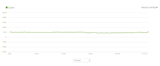
How can be useful such a graph? The Y scale is way too large and we can't see the variations of height.
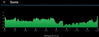
In Garmin Connect app it works properly (same activity)
How can be useful such a graph? The Y scale is way too large and we can't see the variations of height.
In Garmin Connect app it works properly (same activity)
