This discussion has been locked.
You can no longer post new replies to this discussion. If you have a question you can start a new discussion

New overlay on tracks

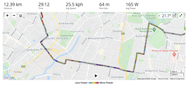
This is new in the past couple of hours, for me at least - coloured tracks to show power, heart rate, elevation or speed. What do you think? Useful?

  • I personally like it and requested it, as Nike+ had it for many, many years.

    However, the relative coloring is confusing, I would prefer either absolute or user-defined.

  • On my daily walks I track them with my Vivoactive 3, starting the Walk app at the beginning, stopping and syncing at the end. Connect then shows the data including a map of the route with 1 mile lap markers.

    In the last day or so the route shown on the map now always shows pace segments in different colours rather than the simple red line previously. When viewed in full screen mode tapping the Map Settings icon now shows not just the map type (as before) but also the Data Overlay. Pace is always selected.

    I don't want any overlay. Changing it to None produces only a temporary change, going back into the map and it's back to showing Pace. The really annoying thing as that all past activities are showing the same unwanted detail on the map.

    It seems another example of change forced on the user with no option to choose what the user wants, only what the developers want the user to have.

    This has only changed in the past day or two, there was a Connect update 2 days ago to Version 4.35 so I'd guess this was one of the changes.

    How can I change Connect default to show no overlay unless I actually want to choose one? I can find no setting on the app.

  • , this is coming from Garmin Connect Web, so I've moved your post here. As others have noted, there is currently no way to change the default overlay to "none."

  • Thanks. Hopefully will be fixed before too long.

  • I also don't see tracks recorded on my Edge 530.

  • possibly useful but I  don't like it. 

    It would be better if  the default was none.

    Even if I liked seeing the pace, it is inaccurate. 

    My 5km run this morning was totally blue. But my walk later had a variety of colours

  • I hope so too. If you want Garmin to be aware of this, best to contact them directly via the Garmin Support Center.

  • A few thoughts in no particular order :-

    On the new overlay red means faster, blue means slower, which is the opposite of the colour coding on the existing Cadence graph. Consistency would have been helpful.

    Can the pace indications usefully handle a "there and back" run over the same route? Especially if "there" is a threshold run, and "back" is a recovery jog.

    Are the indications of pace relative to my own pace, or some hypothetical norm?

    A run I did on Monday at a pace of 5.51 per km (don't laugh, I am 70 after all) shows mostly yellow with a little green, while Wednesday's run (6.10 per km) appears mostly orange with a little yellow, i.e. faster. 

    I can't see this feature being of any practical use or of interest to me. I suppose it's a bit of harmless fun, but the thicker trace lines are a bit irritating when zooming in to large scale. It would be far better to have it as an "opt-in" for those who want it, but with the option of having "no overlay" as a default

  • I find it very annoying, primarily because panning and zooming are dramatically slowed down; it can take fifteen or twenty seconds for the track to appear when I pan to a new section.  They really need to provide a way to set the default overlay to NONE.