
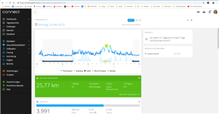
It seems that Garmin has updated the daily summary on the garmin connect website. But in my opinion not very well.
For me, this page was a quick view of important data for each day in one view. Now, i have to scroll down to get the information. Maybe garmin did not understand how a mobile website or desktop website should work. Now it seems a mobile website and looks like the Garmin App. A big advantage to other companies was this website for me. Because most of others have no website (beside Polar these days) or have a bad dashboad like Fitbit.
Yes, for most cases i can use the mobile App but for some more information or better view, i use the website daily... also because a good overall view of the last day (... which worked until yesterday).
My wish ist to get some information (Steps, Kalories, Sleep, Stress, Heart Rate etc.) in ONE View as a Desktop Website is not a mobile Website/Phone with less space. It is weired and i am not very happy (if it is a trend i also could use a Samsung or Apple Watch :( ).
What do you think???
