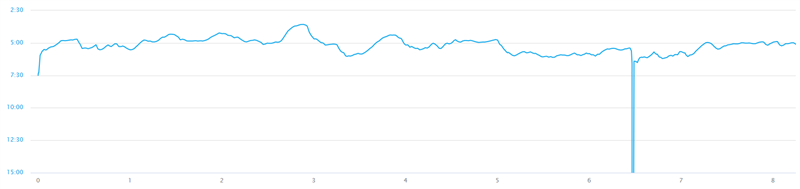
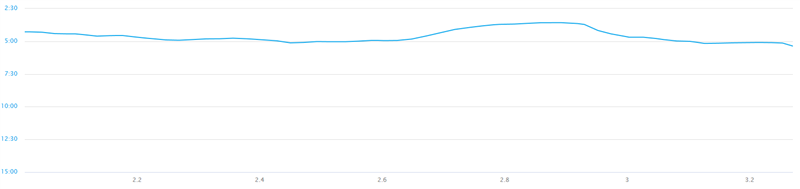
I have been searching through posts dating back to 2012 requesting the ability to change the y-axis on the Elevation/Pace/HR etc plots in garmin connect. Plots look fine on the app but on PC the dynamic range is very large giving the data no meaning (basically a flat line). The elevation especially is completely useless.
Its seems like a very straight-forward request and standard functionality of most plotting software. It would improve end-user satisfaction immensely, ideally a scroll bar or direct number input for the y-axis numbers.
Alternatively, an explanation of why it may not be a easy as it appears would be helpful (no time/resources etc).
Thanks for any response!