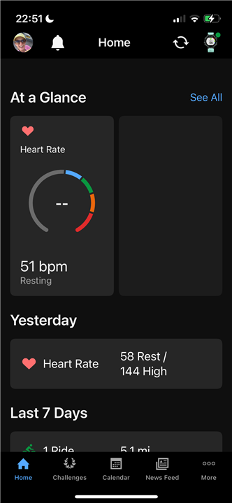
It’s terrible.
Can we please just have the option to go to the old version
Utterly awful. Used to be clean, on one page and easy to see. Now have to scroll to find things. Poor work Garmin
I agree that it is terrible, I was so at home with the previous format and now am all at sea. Please can it be changed or give users the option to revert back?
Thank you for the suggestion, I really do appreciate it. However, It’s the same issue. I don’t need a big circle for my heart rate etc. it uses up lots of space. ‘At a glance’ to means one screen, no scrolling. Before with horizontal lines of data I could see HR, steps, weight, menstrual cycle & activities, pulse yesterday & some of week. Ie > 2X the info, all in ‘one glance’. I see so little info now in ‘one glance’ (I know I can add another stat but don’t want to share that publicly. Thanks again.
I just updated Garmin connect and wow! I wish I hadn't! The new update and UI is absolutely awful. A terrible use of screen space. Looks like something a ten yrs old would design. I want the old version back!! Hey Garmin, if it works don't fix it! Incredibly disappointing.