It’s terrible.
Can we please just have the option to go to the old version
Utterly awful. Used to be clean, on one page and easy to see. Now have to scroll to find things. Poor work Garmin
I agree that it is terrible, I was so at home with the previous format and now am all at sea. Please can it be changed or give users the option to revert back?
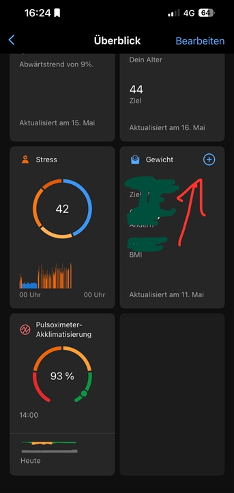
I would like to help you with this but I don't want to make things more complicated for you - so I will just ask a question - do you have weight as one of your "at a glance cards"? If you do you should just be able to tap the + sign in the upper right corner and add your weight from there.
Yes, I do that have that glance card, but it is buried with others in that section. Yes, I know you can add weight that way too, but again its not as simple as it used to be. There are more steps involved. That is the issue. The Add Data button that used to be there and was simple and easy is now gone. I can't find an option to add that in the new interface. I have given this interface nearly 3 weeks of a chance, but I'm fed up with it. It is not simple, not intuitive and frankly, I don't want to spend more time on it. It is a clunky UI.
All you have to do is look at all the related forum posts by people unhappy with this new interface. It doesn't take a rocket scientist to see there is serious push back from the community of users to this new release. Most of us are only looking for the option to return to the original home interface. If other users want the custom options and the other cards, tabs, etc. that is fine, they can do that. But I think for most of us that are being vocal about this just want the option to go back to the way it used to be. Add that option for users.
App open, scroll to weight. Tap „+“
I find it very easy to press the "+" once.
I am sorry that I cannot understand why it is so difficult to add the weight.

If this is too complicated for you, why don't you just use the Garmin Index scale ?
Then you don't even have to press "+". Get on the scale and your weight (and many more metrics) will be automatically synchronized.
While we both tried to help I think that we did it in different ways. I think the bigger issue being made by the OP, more than just being able to add weight, is that many functions have be removed and while Garmin says that the New Home Screen is completely customizable - it is not when limited to the available options that Garmin have deemed to be appropriate or valuable for all users. The previous version was far more customizable. People may be more inclined to warm up to the huge tiles and wasted space if it was truly customizable and they could get the data that they really want to see on their home screens. Yes it works for many but it also is extremely lacking for many others. It appears that you either can't or won't see this because it works for you and you have no issues with it. I think it is unintentional, at least I hope, but your posts often come off as condescending which off-putting and is unfortunate because it does seem that you have a lot to offer in terms of knowledge about Garmin products.
Oh and that scale is pricey and if the user already has a scale why purchase another? That is just a waste of money.
Yes it could be but some probably need to have the font bigger to be able to read the tiles, even so the smaller tiles you have shown are still too big and have too much wasted space. Why have a tile that size with such little data on them? Why have a tile at all when that could be a list of horizontal bars and you could have 10+ bars with the same amount of data on the same screen and see them all at once? The tiles are clunky and cumbersome, they don't work well on phones at any size.
Getting used to it was a bit difficult. At first it would buffer steady, drive me crazy. Now that everything has settled down the new version is pretty good. The at a glance feature has larger icons with more detail. Able to view more metrix or select all and see them all. Overall I like it now. Change sucks. Just set it up to view what you like and it's great.
It's an athletic data and metrix app. Get out there and rip up the trails. Have fun.
I wonder if it's a phone screen size problem where people can't see as much.