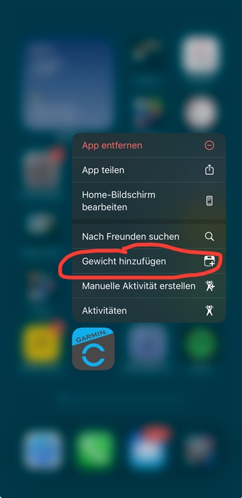
It’s terrible.
Can we please just have the option to go to the old version
Utterly awful. Used to be clean, on one page and easy to see. Now have to scroll to find things. Poor work Garmin
I agree that it is terrible, I was so at home with the previous format and now am all at sea. Please can it be changed or give users the option to revert back?
Yes, agree! I can’t easily find anything on the new app homepage. They need to give us the option to go back to the original. Perfect example is to now add my weigh in everyday, I now have 4 extra steps to enter that data in the new interface, instead of having it exactly at the bottom! Thanks Garmin. Try asking user before making idiotic changes to the interface!
Yes, completely agree. Garmin needs to give us the option to return to the original homepage on both the mobile app as well as the web interface. The new interface takes me 4 more steps to do something simple, example is a morning weigh-in. Now it takes me 4 extra steps to enter the data, instead of the simple original method of scrolling down and entering it. This is NOT progress Garmin. Give users the option, don't mandate these changes! How hard is it to listen to your customers? If some want to customize and accessorize their home screen, fine, but for others that liked the old interface, give us the option to keep it! That isn't that hard!
The new interface takes me 4 more steps to do something simple, example is a morning weigh-in. Now it takes me 4 extra steps to enter the data
1) why are you posting the same thing twice ?
That isn't that hard!
I wonder how you come up with extra 4 ?

Hi, thanks for pointing this out to me. I wasn't aware of this feature. Unfortunately, that is not what I'm talking about. If I already have the app open, which I usually do most of the time during the day and night, your method would involved the following steps:
1. close the app
2. tap the app and hold it
3. hit add weigh in
4. enter my weight
So, again you are not solving the issue. So this method is not a clean solution. Here is how I get to 4 steps with the new home interface:
App is already open
1. Change from home screen to More
2. Tap Health Stats
3. Tap weight
4. enter my weight
That is four steps! The option of having it right at my finger tips on the home screen is now gone. I didn't get a choice. You can argue its easy, you can argue that this is better, but in my book and working with lots of people in projects on UI interfaces, these are extra step and needless hunting around to get to something that was accessible on the home screen with one tap. That is poor UI engineering!