Dear Garmin Team,
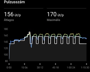
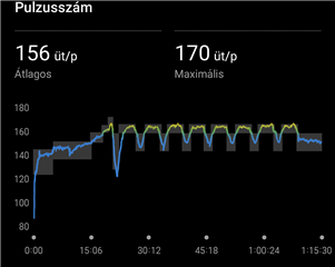
I would like to suggest an improvement for the way planned heart rate targets are displayed after activities. Currently, the system only shows a single thick white line indicating the average target heart rate. This approach is misleading, because coaches usually set a range (e.g. 80–142 bpm), not a single value. The white line gives the impression that only the midpoint matters, while in reality the goal is to stay within the whole range.
I believe it would be much clearer and more useful if Garmin displayed the entire target range as a shaded band (for example, a thin transparent or light grey area). This way athletes could immediately see whether they are inside or outside the coach’s prescribed zone.
If the range cannot be shown as a band, then at the very least the current white line should be thinner or semi-transparent, so it does not block the visibility of the actual heart rate curve and the color zones behind it.
This change would make the visualization more accurate and practical for users who train with personalized heart rate prescriptions from their coach.
Best regards Lorand


