This discussion has been locked.
You can no longer post new replies to this discussion. If you have a question you can start a new discussion

Heart Rate target

Dear Garmin Team,

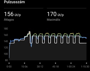
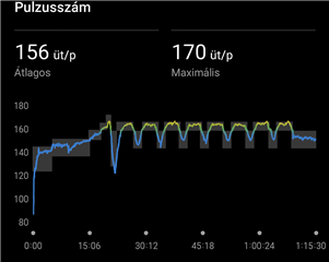
I would like to suggest an improvement for the way planned heart rate targets are displayed after activities. Currently, the system only shows a single thick white line indicating the average target heart rate. This approach is misleading, because coaches usually set a range (e.g. 80–142 bpm), not a single value. The white line gives the impression that only the midpoint matters, while in reality the goal is to stay within the whole range.

I believe it would be much clearer and more useful if Garmin displayed the entire target range as a shaded band (for example, a thin transparent or light grey area). This way athletes could immediately see whether they are inside or outside the coach’s prescribed zone.

If the range cannot be shown as a band, then at the very least the current white line should be thinner or semi-transparent, so it does not block the visibility of the actual heart rate curve and the color zones behind it.

This change would make the visualization more accurate and practical for users who train with personalized heart rate prescriptions from their coach.

Best regards Lorand

  • The white line gives the impression that only the midpoint matters, while in reality the goal is to stay within the whole range

    It depends which model you own, but AFAIK all of them show you the target HR range. See below the example from Instinct 3 Crossover, where the watch hand points exactly the value within the green range, and you see immediately whether you are closer to the bottom or to the upper limit of your range, or whether your are well in the middle of it. And it is working in the same way also on Instinct 3 Solar (the second screenshot). This testing workout was set up with the HR range 90 to 120 bpm:


  • ... so all you have to do, is trying to stay within the range (the green arc in the case of Crossover, and the white rectangle in the case of I3 Solar), so easing down when you approach the right threshold, and increasing the effort when the pointer drops down to the bottom limit.

  • Yeah, it's the same issue if you are running to a prescribed Pace. The Chart in the App shows one white line despite the required Pace being in a range. It does make viewing the target Vs actual quite difficult.

  • Well, what confused me was that originally you wrote:

    I would like to suggest an improvement for the way planned heart rate targets are displayed during activities.

    ... since during activities you can only see the target on the watch, not in Connect. And because users do not really respect the forum structure, and frequently post watch related issues here, I assumed it was your case too. Sorry for that.

    Otherwise, we cannot really help you with adding the range to Connect, but you can suggest it to Garmin at Share Ideas | Garmin 

  • Yes, I realized afterwards that I used the time marker incorrectly, it's not my native language, sorry.
    Thank you