Does anyone like the layout of beta web page?

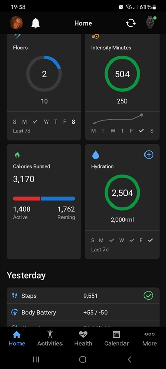
I dislike the new home screen on the web,  I was told that I can not go back to the classic design.  I submitted my complaint to the developers though Chat.  Anyone else submitted negative feedback?

Top Replies

All Replies

  • New layout is really bad both on my Samsung Phone and on the web page. Please change it back or at least give everyone the option to choose which one they prefer. Might have to dig out my old Fitbit watch.

  • Resting heart rate apart from right now 

  • Not only is it a poor view that makes it harder to see details at a glance. It doesn't even display detail on the tiles that match the actual values, for example this on hydration;


  • The really funny thing is that I was involved in the BETA program and you couldn't even provide feedback into that forum.  You would click reply and fill in everything and then couldn't push send or rate.  I did it about 3 times over the trial person and gave up on giving feedback.  First of all. .... Where are all of the nice colours.  At least give us the option of reverting back to the old version.  The only thing useful to me now is the Calendar view.  I would love to snip a picture and attach to the workout so then I can look back on what I did over the month and you would see a bunch of tiles when you clicked.  The last 7 day data links can't be working as I have done 3 workouts this week and it only shows todays workout.  Thinking when this Garmin dies I'll just move onto another platform and get a different watch.

  • Everybody should rate it on google play store. Leave them a 1 star for the app "garmin connect" ....maybe somebody will realize the scale of That problem.  

  • I just did this as well. Maybe public feedback will mean more to them.

  • I don't like the new format at all.  I do programming for a living so my biggest complaint is it is too many clicks to get to the information that I like to see.   I am not allowed to change the order of yhe screens that show.  I like to see certain information on my front screen but to get to it I now need yo click into the list and then scroll down to see it.  This is no longer easy to use.

  • Looks fine

    That's not fine, look at all that empty space. 

  • I'm guessing ? that there won't be a backtrack until it failure of the new app to engage and be user friendly can be related to a dip in sales. If the goal was to reduce engagement with the Garmin app- yes it's achieved it..it's over complicated, you see less information in one glance etc. Who wants to spend more time scrolling on their phone, going through different menus..? I can't be arsed with it.. and will def either just do it all on Strava going forward - which is shame as on a Forerunner 35 I can't record my swimming, and obvs it doesn't log my sleep or heart rate in 24 hour period. But this is a  pain in the ***. 1st world problem definitely - but why *** it up??? And I'm not buying a new Garmin device just to fit in with this new app update - tho I will be looking into the other options available with competitors,  including their app interface. Thanks Garmin, what a load of shite.