This discussion has been locked.
You can no longer post new replies to this discussion. If you have a question you can start a new discussion

At a Glance - Tiles/Cards display feedback/suggestion

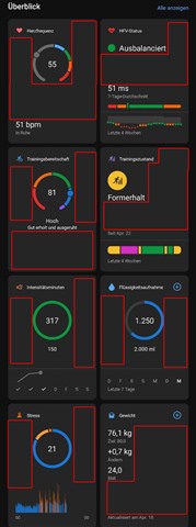
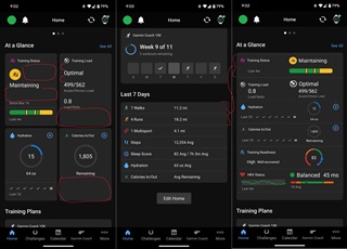
"At a Glance" has a LOT of blank space in the cards/tiles.  The "Last 7 Days" section looks a lot cleaner and I think the glances could be cleaned up so it doesn't require so much screenspace or scrolling.

Making them screen width and about 2 line long as compared to the "Last 7 Days" section could allow for fitting the information in a way that truly allows a glance at the information with the option of touching/clicking the tile for a deeper dive.

I made a quick edit of what that might look like.  I think if they were separated a slight bit like the tiles vertically, it would be fine as well.  That could separate the glance sections a bit visually as well so they don't run into each other.

I went to the "Beta Program" forum section, but it looks like it's for the device beta programs as there wasn't a specific section for the GarminConnect sofware Beta.  I did "Give feedback" but I thought a visual representation of what I had in mind might help.  There wasn't a way to upload a screenshot/image with the feedback.

  • This is exactly my problem.  Want list option back.  Now I have to swipe my screen several times just to view my day.  I prefer to do quick looks and that is gone.  Seems messy and lots of useless space.  I know change is hard but sometimes change is not actually better.

  • Yes - the screen width/list version had much better density.  I tries removing more at a glance cards and relying more on the 7day summary but if you remove a card it also pulls that dat off the 7day view - argh

    At a Glance should have an option for card vs list view 

    And the In Focus display contains almost no data compared to the huge space it uses - All Activities Trend on my watch face at least does stacked bars of diff colors for walk/run/cardio etc... how does an almost full screen display not even have that... so much potential to combine more data in this view size but as is I am keeping turned off

  • Yes! So much waste space to produce the opposite of a "glance" implementation.

    I want an "at a glance" dashboard, not tiles I have to scroll vertical AND horizontal.