Hi.
Is it possible to get some help understanding step speed loss.
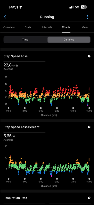
There are two charts for it, one step speed loss and one step speed loss percent.
I’ve attached a photo of the last run I did, and it shows a whole lot of red dots on the step speed loss section, that’s not good.
But on the percentage section it’s a lot of green dots, and that’s a good thing I guess.
Why does one have many red dots and one have many green dots?
Shouldn’t those two show the same?
Or am I missing something?