Dear Garmin Product Support team,
I’ve been a devoted Forerunner user for more than 15 years and remain extremely happy with the line. The Forerunner 970 is easily the best sports watch I’ve owned—thank you for the continual improvements.
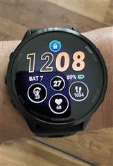
Suggestion – make data easier to read: On several native watch-faces (see attached photo) the circular data fields allocate far more space to the icons than to the values themselves. Because the numeric data (steps, HR, training-load, etc.) is what users scan most often, it would be much clearer if
- the icon were smaller, and the number used a larger font, or
- an option existed to hide icons entirely once a user knows which field is which.
Thanks for considering the idea—and for building watches that have accompanied me through countless activities (runs, rides, and swims), and leisure.
Best regards,
Matej