
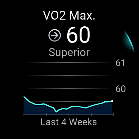
Look where the 60 and 61 marked lines are vs the actual graph that has a VO2 Max of 60.
Surely the graph should be up at the line marked 60, not what one would imagine is 59.5 looking at the markings.
Look where the 60 and 61 marked lines are vs the actual graph that has a VO2 Max of 60.
Surely the graph should be up at the line marked 60, not what one would imagine is 59.5 looking at the markings.
I have worked it out. The actual VO2 max at two decimals is around 59.4 but it rounds up whiole number to 60. So the graph and labeling are correct . Wish they’d show two decimals though as that is what…
Yes but it was probably the same before . I think it is correct if one has the further decimal figure . The large number reflected is rounded up to nearest full digit so the graph reflects about 59.4 which…
