
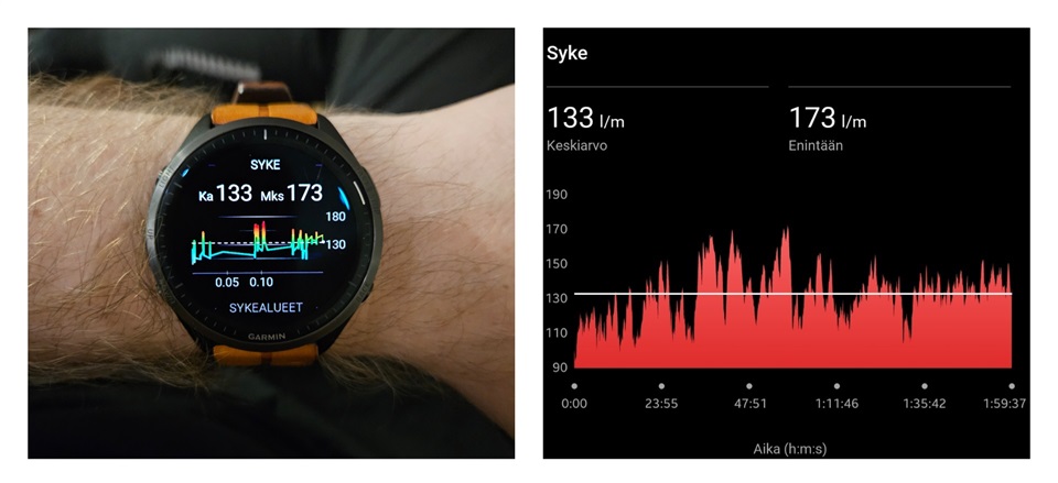
Version 16.17 didn't fix this issue with graphs on the watch. On Garmin Connect the X axis on every graph is elapsed time, but on the watch it's distance instead. That makes especially HR graphs look ridiculous on activities which are not distance based. The picture is from a 2 h badminton exercise and the graph is totally messed up because of this. Garmin has made a totally random distance estimation of 190 m and then plotted the HR related to that.
I think all graphs (HR, speed, elevation) on watch should have elapsed time on X axis like on Garmin Connect.