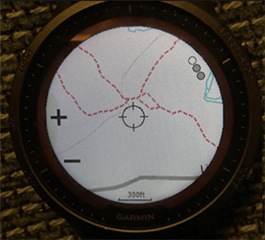
[20.26] Regression in the map feature (zoom buttons are black, forest not green)

Hi

Update 20.26 also brought a deterioration in the performance of maps. I see 2 problems.

1. The zoom buttons are black, they are no longer transparent.

2. The color of the forests is no longer green and has become green-brown.

I remember both problems were there in the past but were fixed. Now they are back.

  • Yes, same here... would also prefer transparent but not as much of an issue for me tbh (as in, can still properly use it). Same for the colors, for me not as much as an issue (can't remember this being the case before btw)

  • These are not things that make it impossible to use the maps. But they make it less comfortable to use. The black buttons cover a large part of the map image on such a small screen. And this beige-green color is simply unsightly.

    Something has clearly changed in the rendering of the maps. I have also noticed a positive change, small paths are now also present at slightly greater distances than before.

  • Yes, confirmed.

    The +/- is black instead of transparent and the forests are shown brownish-green.

    Should be changed back, I agree with you.

  • Yeah, I reported this a while back:

    [https://forums.garmin.com/beta-program/forerunner-955-series/public-beta-bug-reports/i/public-beta-version-20-xx/map-page-pan-zoom-buttons-have-black-background-used-to-be-translucent-which-blocks-a-significant-part-of-the-map]

    Worth noting that the same bug happened on 945 LTE in the past (long before the current iteration of this bug), and it was fixed at some point.

    As always, history repeats itself at Garmin.

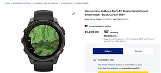
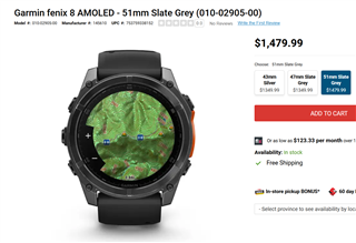
    It’s funny bc I see the solid black buttons in various marketing pics / store images for Fenix 8, but some of the review videos have the translucent buttons. So it looks like this was changed at some point for Fenix 8, as well. (Not sure what the current status is tho.)

    There’s a related bug where if you use the dark map theme, the buttons are simply not visible (it’s just a solid white block):

    [https://forums.garmin.com/beta-program/forerunner-955-series/public-beta-bug-reports/i/public-beta-version-20-xx/map-does-not-show---for-zoom-even-though-the-button-exists-and-works]

    Yes, same here... would also prefer transparent but not as much of an issue for me tbh (as in, can still properly use it).

    It’s just a huge waste of space on the map.

    1. This is what it looked like on old non touch watches (completely transparent background / no background):

    2. Touchscreen watches added a translucent black background (makes a certain amount of sense since they’re now tappable buttons instead of merely button hints):

    3. Of course, recently, the background was changed to solid black — look at how much space is wasted in comparison to the above 2 pics:

    Like I said in the bug report, if this change was done for performance reasons (i.e. translucency is too expensive), then I would prefer to go back to the very basic completely transparent background in image 1 above. It doesn’t blow you away visually, but it doesn’t waste a ton of space either.

  • Even in the newest firmware 20.29 Forerunner 965 still has transparent background on the zoom buttons. So is it an issue only on MIP devices? That would make some kind of sense since transparency effect is more difficult to do properly with only 64 colours. That might also explain why some Fenix 8 images show transparency, other don't (if some images are from amoled versions).

  • Even in the newest firmware 20.29 Forerunner 965 still has transparent background on the zoom buttons. So is it an issue only on MIP devices? That would make some kind of sense since transparency effect is more difficult to do properly with only 64 colours. That might also explain why some Fenix 8 images show transparency, other don't (if some images are from amoled versions).

    Yeah it could be that they changed the translucency code in a way that works for AMOLED devices (with 65536 colours), but doesn't work properly for MIP devices (with 64 colours). Once again this would be a bug which arises from having multiple models share the same common code. We've seen this over and over again.

    Note that 945 LTE is MIP, it originally had the old fully transparent background / no background as in the image 1 above, then it changed to the black translucent background as in image 2 (when it got the new UI from FR955 / etc), then it had the black background bug as in image 3, and finally it received a firmware update to revert back to the black translucent background.

    FR955 also had the translucent background as well, for a long time.

    This proves that:

    - At least two MIP devices (945 LTE and 955) had working translucency for the black button background. (I'm fairly sure image 2 in my previous comment is from a MIP device.)

    - One device (945 LTE) had the solid black background bug in the past, and Garmin saw fit to change it back to translucent. This suggests that not only did Garmin acknowledge it was a problem, they decided it was a problem they could and should fix

    But again, it would submit that if it's "too hard to do translucency on MIP" (despite the fact they already did it lol), or if they think it's too much of a battery drain, or whatever, then it would be much better to go back to the old fully transparent background (or no background, if you prefer) of the old watches.

    Not only does the current solid background waste a huge amount of space (covering up part of the map it would be nice to see), it also looks bad, and in the case of the dark map theme, it causes the buttons themselves to disappear (the buttons and background are both white.)

    That might also explain why some Fenix 8 images show transparency, other don't (if some images are from amoled versions).

    But the images that show black buttons are supposed to be images of the Fenix 8 AMOLED models. They appear to be renders, too. It's just funny that marketing renders would look worse than the real product in this instance.

    It's not like the primary search results for "fenix 8" or "fenix 8 map" are gonna return the solar (MIP) versions anyway. Everyone knows that MIP is dead.

    www.bestbuy.ca/.../18245809

    https://www.visions.ca/garmin-fenix-8-amoled-51mm-slate-grey

    (Yeah I realize it's just the same marketing image in both cases.)

  • Yes, clearly transparent background on MIP is possible, since that's how it used to be. But the map rendering engine was clearly replaced or heavily altered in 20.x (map rendering has reported to be faster while panning, there was the thick road border bug, etc.). But it's possible that the new engine doesn't support partial transparency on MIP. Impossible to know, but it would explain why the background is always black on 955 but translucent on 965. And yes, if that's the case, the solution of course would be to remove the zoom button background on MIP devices.

  • It annoys me that Garmin's changelog very often doesn't include all the things that have changed. This is the 20.26 changelog and I don't see even a tiny mention of something as big as the rendering engine change.