
Software version: 15.19
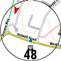
Would it possible to change the format of the HR Gauge when it is added to a map? I'd like it to look like the photo-shopped image below. I find the gauge much easier to read than the HR number and it's easier to see at a glance which HR zone I'm in.
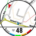
Currently, when the HR gauge is added to the map, it appears as shown in this screenshot - note the actual gauge is missing
Thank you.