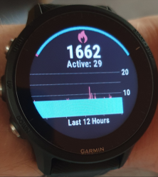
In my calorie chart I have this blue rectangle. Has this happened to you?
It does now. Thank you. It just looked a little weird.
The blue rectangle represents your resting calories over the last 12 hours, and the red spikes are your active calories in comparison. Does that make sense?