
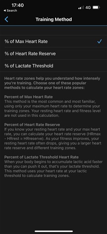


I came from Forerunner 945 and moved over to Forerunner 955. As I tried to set up the HR zones, then I had to pick HR type, and to be honest, from a usability point of view, even from a rapid runner, I had to twist my head around understanding the semantics of the different types. It took me quite a while before it made sense to me.
As feedback to Garmin. Id suggest changes to the semantics to make it easier for users to understand what the different types of HR measures are without having to google they way through.
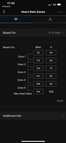
And while picking HR zone types that are selected as percentages, then I would also suggest that the actual HR is showed next to the percentage. Ive tried to illustrate through images.
