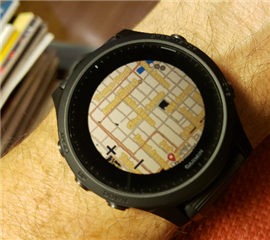
I find the the fonts used for the street names on the maps almost impossible to read. They may look ok blown up on a picture taken on my camera, but trust me, when I'm out there looking at my watch without extra help, they are pretty much illegible, hence useless.
I'm fairly certain I've seen pictures in reviews of this screen with simple easy to read thin black font .. does everyone else's map look like this? I've done all the various updates.
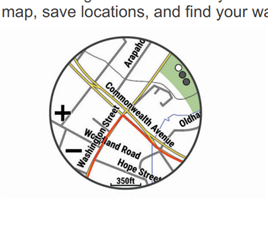
From the manual, clearly more legible