Viewing Heart Rate Information chart with heart rate zones

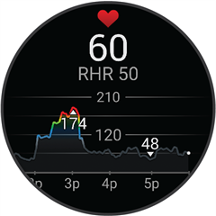
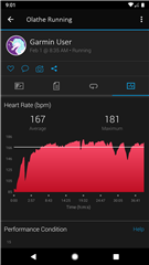
When viewing an activity on the Garmin connect Webpage (or app), is there a way to display the heart rate chart from an activity with the HR zones colour-coded on it to highlight which zone you were in, like how it it appears on your watch directly after an activity.

The watch displays the HR chart colour coded to the HR zones (which is useful), yet the app and webpage is just a plain single colour.

If this is not currently supported, @garmin can this be a feature request?  You already have the capability as the watch displays this information...its just on a tiny screen.

  • Hello,

    There is not a way to do that, your activity already gives you the zones under "charts" which is why the coloration is not there on the HR graph through the activity itself. We color it on your all day HR graph on the watch so customers can tell a difference between the BPM's they are getting throughout the day (or it would just be a solid color which is not helpful on the all day HR graph). This would be by design, you can always submit an idea to change it but the zones on the activity are there! 

    Here is the link for the form to submit ideas: 

    https://www.garmin.com/en-US/forms/ideas/ 

  • ok thanks for the response. I have noticed its on the all day chart but the resolution is not good as throughout a 24hr period, a 30min-2hour workout is a small slice.  The majority of HR over 24 hours is not even in Zone 1.  I can't zoom in enough on the day chart to see the detail of my heart rate and correlate that to a particular interval of my workout, that's why I would find it useful on the activity itself.  I will submit the idea on the link you posted.