This discussion has been locked.
You can no longer post new replies to this discussion. If you have a question you can start a new discussion

Initial impressions after upgrading from Sq to Sq 2 (Music)

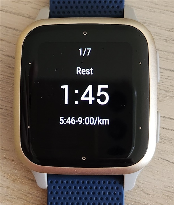
I have jumped on the opportunity to get the next iteration of the Garmin Venu Sq Music. I am using the watch mainly for running & golf.

So far I am very pleased with Sq 2 Music. Here is quick list of my pros and cons... what stands out for me so far after first run and one round of golf:

Pros:

  • far superiors display
  • significantly better battery life
  • better GPS performance
  • fixed issue with Golf units option 
  • My Galaxy Buds Live seem to have far less connection drops

Cons:

  • so far I am seeing slower GPS acquisition compared to Sq (but not to the point that it would be an issue)
  • the use of the screen real-estate for the data screens is still mediocre. There is still a lot of black empty space that could be used for valuable info (like zone #/ total # of zones)
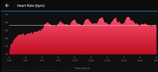
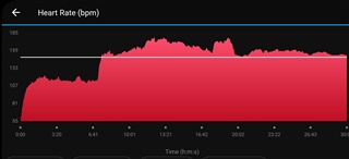
  • Heart rate data after my first zone workout looks pretty bad compared to old Sq readings:

Venu Sq:


Venu Sq 2:

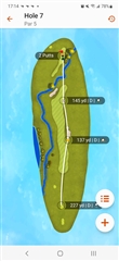
  • Golf auto-shot has a bug where in case of the 'club prompt' set to off: all captured shots are labeled as 'D' for driver. It seems to be mobile app issue (Android) since it looks fine on the web (Garmin Connect):

Overall I am very happy about the upgrade and can recommend to anyone who's hesitant...

  • Surprised about HR since the new model has the latest sensor. GPS may improve after it downloads the latest ephemeris data for your location. 

  • Congratulations on your new watch, I hope you enjoy it, I want to ask you if the font size in the notifications is as small as the previous SQ

  • It's definitely bigger, but like I mentioned above the use of the screen real-estate could definitely improve.

    For example zone time countdown font is bigger, but there is no zone number info. It only shows on the next zone notification screen and than it's gone... 

    Also I forgot to mention in my original con's list - I really don't care for these 'dots' on the perimeter of the display.

    They kind of make sense with a classic watch face, but in all other times they just look weird.

    When I first took the watch out of the box I thought it was some damaged piece, because I didn't notice this design feature on the Garmin photos of the watch... 

  • Can you take a picture of the notifications appearing now? The font size on the SQ is also too small for me

  • Sorry Michael, I am not using the notifications, I setup the watch without it and when I tried to enable it now to take a photo it doesn't seem to work... 

    Maybe someone else who uses this feature can help...? 

  • I just noticed this update of my original Venu Sq.  Was thrilled to find out they removed the Garmin logo at the bottom, then I noticed the dots.  Those dots really don't need to be there for any reason whatsoever.

    I have one ordered simply for the 'taller' viewable screen and it being amoled.