This discussion has been locked.
You can no longer post new replies to this discussion. If you have a question you can start a new discussion

Font size in structured workout

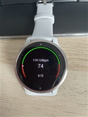
I just got a garmin venu 2s and started a structured workout but the information for each step is presented in a really small font compared to the other screens. Is this a bug or a problem with my workout? In particular, I'm looking at (or trying to look at) the time remaining in the step

  • I also see that garmin is using way to small fonts in their systems. I don´t think it is a bug. It seems a "feature" from the designers ;) Also in Watchfaces, the numbers are small as hell. 

  • Hi there! This is not a bug, I can create a customer experience case for you with this feed back. 

  • I totales agree. Nice watch but Font size sometimes ist way too small. 

     A report to the SW Team would be nice.

  • Thank you, it would be great that for structured workouts you at least get the target (in my case HR) and the interval remaining (in my case time remaining) the same. Ideally, a bit bigger, I can see it clearly when I'm not moving, but while running I have to keep my watch still to be able to read the number, so it takes me a while...

  • So after using the V2s for several days I have to say that many fonts are too small. Of course it also depends on the sight quality of the user, I don't have the best eyes anymore, but f.e. battery percentage is always VERY small, too small, you can see somewhat of a number but sometimes it is hard to see the exact number. In control menu and settings too. The sleep font size is mostly also VERY small, you CAN read it but it is very small and you have to really look very closely. So I love the size of the V2s but the fonts are in many situations TOO small, esp when there is text involved. It was sometimes almost easier too read on the VA 4S with it's bad quality display. Some adjustment from Garmin would be cool. It feels like they just shrink the V2 display without considering that the display IS smaller and the fonts maybe too small. 

  • I agree with you.  While I realize that the screen is smaller on the 2s than the Venu (original), the font sizes are so tiny that I'm having a hard time seeing them.  

  • So after using the V2s for several days I have to say that many fonts are too small. Of course it also depends on the sight quality of the user, I don't have the best eyes anymore, but f.e. battery percentage is always VERY small, too small, you can see somewhat of a number but sometimes it is hard to see the exact number. In control menu and settings too. The sleep font size is mostly also VERY small, you CAN read it but it is very small and you have to really look very closely. So I love the size of the V2s but the fonts are in many situations TOO small, esp when there is text involved. It was sometimes almost easier too read on the VA 4S with it's bad quality display. Some adjustment from Garmin would be cool. It feels like they just shrink the V2 display without considering that the display IS smaller and the fonts maybe too small. 

    Hey! Thank you for the feed back. I did get a user experience created for this. Keep in mind, that does not guarantee any changes will be implemented but if something changes I will keep you updated. 

  • Thx, that would make it much more enjoyable.

    Besides some bugs I love the watch and don't find any significant bugs on my watch which would make it unusable. But I would love to use the watch more without the app, and the very small font sizes makes it not enjoyable, I always go back to the app but want to use it more standalone, which is very much possible with Wifi sync. Please do work on it, Garmin. Thx. 

  • Same here. In my case, it's the remaining distance that is almost impossible to read while running and trying to avoid potholes.