Hi,
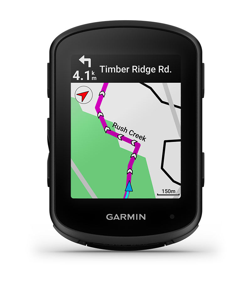
can anyone, please, tell me, why the little hand icon for "map browsing" is right in the direction of ride? It really covers important part of the map. Could be, please, this "browse" icon be under the "+" icon or anywhere else? This position is really unfortunate. Thank you!
Like and vote up if you would like to move this icon to some better place on the screen.


