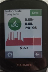
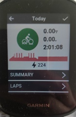
So, my "problem" is that the power has usually purple color everywhere (Connect, Strava , etc) but here , in the summary page, it is red. Wouldnt it be better in purple? :) if somebody has no powermeter, just HR, then the red color and graph is perfect. (i dont know what is the situation here if somebody has no HR and no Power, just speed and/or cadence, then what kind of charts are drawed?


