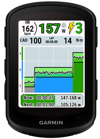
Edge 840 workout data fields

How are you guys setting up your Garmin Edge 840 data fields for outdoor workouts? 

I can't seem to find a way to display just the power target on a data field, ie 280-300w. No bar graph, no lap avg, just what my power target is. 

IMO both the default workout data screen is to hard to read, and creating a customized data screen isnt much better on the 840. The 530 I had before had better options. 

Basically I just want to see a data screen that looks something like,

Target power (this is the biggest fail)

3s power

Interval duration

Bar graph

Step counter

Target power data field just shows a hard to read red/green bar, lap avg pwr which is useless, and then in small font your current power. I just need to know my target power ie 280-300w. I

wouldn't be surprised if I'm the issue, so thank you to whatever kind soul can enlighten me. Or just join in on the b*tch fest because something like setting up a workout data screen on a crazy expensive computer should have lots of options. The fact that they even lock some of the data fields on the default workout data screen is crazy. 

  • Yep.  Here's my take on the workout screen and fields.  Lot's of room for improvement.

    The font size for the interval time and target are very small. I can usually see them fine but not in poor lighting or on rough surfaces.

    There is no countdown timer for the entire workout on this screen.

    The vertical slider pointer on the left of Target lags and jumps too much to be of value. The central block is red whether I’m above or below target. Different color, perhaps yellow for below would be helpful. Have the arrow respond quicker and more smoothly, or use that real estate for something of value

    The Up/down arrows to the right of 3 sec power are red whether above or below target. It would be better if the color was different, perhaps yellow for below. Also, they seem backward to me. My intuition is the arrows should indicate what I need to do. e.g If power is low, arrow points up indicating a need to increase power, and vice versa. As it is now, the arrow points up if I’m above the target and down if below the target, showing where I am rather than where I need to go.

    When pausing a workout, power averaging isn’t paused so when resuming that interval, the avg power shows much lower during the rest of the interval. 

    For my purposes, the Workout graph is too short, longer or user settable would be good.

    IDK where "Step distance" comes from. It's of no value to me during a workout. I'd rather see secondary target or something. Or, replace it with two user data fields.

    Data fields:

    With repeats, the "Workout step" shows which step of a repeat you’re on rather than the step number. e.g. 1/2 , 2/2, 1/3, 2/3... If the workout has 12 steps made up of 2x2, 3x2 repeats, you never see which step of 12 you’re on.

    “Duration” and “Time to go” show the same thing, the interval time. There should data field for the time to go for the entire workout.

    If you add a Workout target field to another data screen, it only shows my current power with the up or down arrow beside it and not the target power.

    Training Plan Glimpse on the home page shows wrong days and workouts on wrong days.

  • I totally agree with all your points. For an app from somebody trying their best as a hobby, fine. But for a company like Garmin it's a bit sad. 

    Have you used any 3rd party apps for customizing data screens through Garmin IQ?

  • I have looked at IQ apps/fields a while back and didn't find anything.  Looks like there are a couple of options now, but I haven't tried them.

  • Have you tried Power+PRO?. It's not providing all desired features, but it could be an alternative to Garmin's native field.

  • Hi all,

    I have been struggling for years with the same issues and decided to make a few CIQ fields to suit my needs.

    I have made:

    1) Target Power - a datafield that shows the average of the range of a target. In your example of 280-300 it would show 290 watts

    2) Target Power range - a datafield (taking up 2 fields of width) showing a gauge and the upper and lower range values

    3) Next target Power - a datafield that shows the average of the upcoming target

    I use the standard garmin fields for 3s power, hr, cadence and “reps to go” (the number of repetitions to go in a series of 30/15s for example), “time to go”, “ last lap”.

    If you are helped by it, I could make a datafileld for you with just the range (280-300). In a normal field the font will be smaller than standard because of the many digits to be shown. Alternatively I could make separate “lower limit” and “upper limit” datafields (280 and 300).

    Please try the fields out and post your requests :-)

  • Hello sirfive, I actually just downloaded two of your apps to try. Both look so much more useful and easier to read. Except I can't find "next target power field" .... Could you help me?

  • Welp, just saw your email. Maybe you could still post it here and help others. It's a very useful stat

  • Agreed. This was the biggest disappointment of the Edge 840 for me.

    Issues: 

    • Interval time remaining is comically small at top edge of screen and can barely be seen.
    • Distance remain in interval is irrelevant to cycling power based training as far as I know. Must be a holdover from running?
    • The visual design of the target field is busy and confusing. Just show the numbers large.
    • If I create a custom workout page I loose the ability to swipe up and pause or move backward and forward in the workout (which is fantastic)
    • Workout summary graph does not provide helpful context. It is often too zoomed in and does not offer a visual indicator of how far away the next interval is, or alternatively, an actual visual summary of the whole workout like the one you see when you swipe up for workout controls.
    • The typographic hierarchy is backwards. The most important things are too small to read (current vs target power, interval time remaining) and the least important things are too big (distance remaining, workout summary)

    Looking forward to a better design.

  • Seriously.  It's like nobody on the development team or testers have done workouts.   I'm disappointed,  but based on 15 years with Garmin Edge devices, I not surprised.

  • Just changed my Garmin from Edge 530 to 840 and went for a workout. Extremely disappointed on the new look. On edge 530, it was brilliant. Now, it's very hard to see what's there, especially when you have short intervals with high power, very difficult to see the target power, the estimated time... a lot of empty space in that field. And it cannot be customized. Very very sad on this, as I am using quite a lot the workout field :(