This discussion has been locked.
You can no longer post new replies to this discussion. If you have a question you can start a new discussion

Map Controls

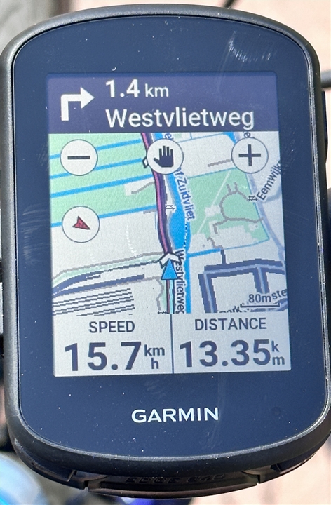
During an activity, the map controls should disappear after a few seconds of inactivity.

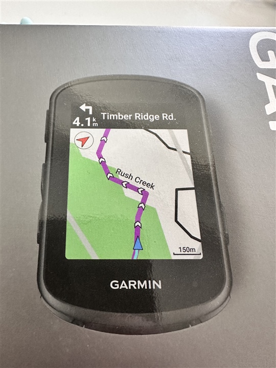
On the map, there are four controls: plus & minus to zoom the map, hand to pan the map and an arrow to change the map's orientation (track up vs. north up).  These controls overlay the map and cause the map to be cluttered.  Tapping the screen should cause the controls to appear and after a period of inactivity (a few seconds) the controls should disappear.

  • This was changed on the 1040/840 and the zoom and pan options are always displayed on the map page.. 

  • That's a nice information that this got changed. So it's not a bug it's a feature. I guess some of us still prefer the old style described by Ken. Maybe you could make this an optional choice of the user in the settings.

  • Personally, I like the new always present controls on the 840.  I find them relatively unobtrusive as they are smaller on the larger higher res screen and faster/easier to access while underway, especially trail riding on the mtb.  Agree making it optional would benefit some.

  • It would be enough to make the controls less prominent. Without the big white circle. In this design, it interferes and the map is confusing.

  • the screen size and res are the same as 830:)

  •  I was about to make a new post when i saw this one. Today i got a new 840 non solar and went for a ride. I was about to rant and complaint about how cluttered the map is and specifically the 12 o'clock icon exactly overlaid on the route, the upcoming portion of route ahead. I really dislike this.

    Somebody said in a reply that because of the screen size he/she does not find it obstructive - well look at my photo, is that map that big on 840? i would love that hand icon to be bottom down left or right than exactly in the gd middle.

  • >>>the screen size and res are the same as 830:)<<<

    I'm comparing to my previous 820 :-(  and earlier Edge devices.

  • Not much of the map left with the two data fields and big black nav bar at the top, so map controls do take up a larger fraction of  it.  I'm sure I'm an outlier in that I always use North up, so my course rarely falls in the top middle of the screen. Having them configurable would be the best all around.

  • Amazingly, the photo of the product on the box looks really clean, no icons on the map, beside the north.

    Maybe this was a last moment decision!? Maybe they will revert back to a cleaner map version.

  • so much this. The way the maps are now (as shown is screenshot) are wayyyy too busy. Too many things being displayed.

    I would much prefer the format in the box photo (or at least instructions on how to clean up / remove map layers). I also have a Bolt v2 which you could argue is too simple, but they do a good job with no noisy map layers - allowing you to quickly glance vs having to really study a map while rolling.