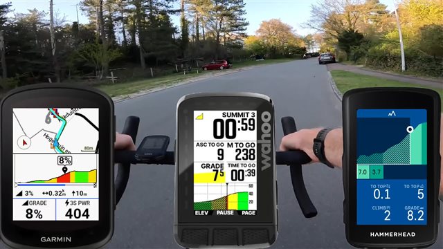
On the ClimbPro screen, I'm finding the Distance to Go and Ascent Remaining is displayed with too small of a font. Along with the graph, those two values are the most important to me.
One potential solution is make the screen more configurable by provided multiple screen layouts. For instance, I don't need the route displayed. Instead, display the Distance to Go, Ascent Remaining on the top, followed by the graph, followed by two configurable data fields.
Note: I have been primarily using ClimbPro Free (not navigating a route).


