This discussion has been locked.
You can no longer post new replies to this discussion. If you have a question you can start a new discussion

Data Field Layout Style Customization

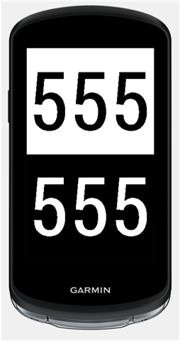
I would like see the ability to fully customize the data layout. Would like to increase the font size of the data. For example when having only Power and Cadence shown, the numbers should fill out the whole display. Be able to either reduce font or remove the description (i.e. "heart rate", "3s pwr", "cadence") entirely. Also be able to remove separators etc.

  • Have a look at HMs DIY in Connect IQ, you would be able to design your own data layout. That project would be very simple to do. But you may just have to wait a few days till the designer of the program updates it to the 840 SDK.

    First though have a look in Connect IQ as I may have seen some data layouts that may already be there that may suit what you want.

  • What leginswal said, but you'll have to wait a few days for it to be updated.  It's a life changer and a time sink, but in a good way.  Imagine exactly the screen and data you want, in the font your want, in the color your want, with the graphs you want.  You want a horizontal line between 3s PWR and HR?  Add it.  Want HR BPM to be color coded and in a bigger font, done.

    You will obsess about it, you have been warned.  :-)

  • Thank you. I will check it out. I am usually not a big fan of third party implementations. It's a bit a call out to Garmin to improve the UI and allow for simple customization as its competitors do.

    Unfortunately it is not possible to increase font size as shown in the example below. Would be great if Garmin could add the ability that would allow for such customization.