This discussion has been locked.
You can no longer post new replies to this discussion. If you have a question you can start a new discussion

Cadence zones?

I'm wondering if I can set a cadence target that would allow me to make better use of graphs during a ride. Say a target of 85, between 80-90 it would be green maybe and below 80 would be yellow, and above 90 would be red. Is that a thing? I'm asking because without varying colors the cadence graph feature seems like a waste of screen.

  • I have been doing exactly that for over a year. But I have to use a 3rd party "App" from "Connect IQ". The "App" I use is "HMs DIY #2", There is also a #1. #3, #4, #.5 and #6 and you can install all of them on the 530 with different setups. The designing needs to be done on a computer though with the HMs DIY program which is simple to use and comes with a lot of examples to see what is possible.

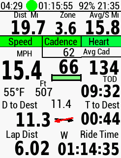
    I have a small rectangualar box below the current cadence data field and when I'm below my target for average cadence it is blue, then it will become red and then yellow and when i'm on my average cadence target it becomes green and then over that it will become green flashing and over that zone it goes purple.

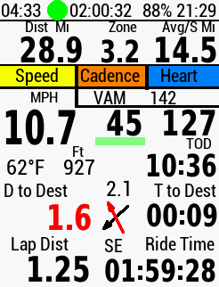
    I also have a similar system set up for current Speed, Cadence and Heart Rate with 3 rectangular boxs side by side and when I am in the zone that I want to be in for all those, they will display green, below and they will be red or yellow. I thought of doing this a long time ago, and finally did it, initially I thought it would be just a bit of a gimmick. But, I was surprised how excellent a system it is, when I glance at the "530" instantly for  a fraction of a second, I see the colours and no need to look at the numerical data fields for a lot longer and have to do number crunching in my head.

    For example, sometimes I get yellow for speed, green for cadence and green for heartrate and nothing seems amiss, but the yellow for speed indicates I am slow, and what this indicates that is happening and usually happens after getting to the top of a hill and just gone over the crest, what I have failed to do is change up enough into a faster gear, a quick change up, speed increases and I will then get the "3 greens". And all that from a very brief look at the "530".

    Many data fields and graphs and scales etc you can get to use, look ok, but, they are just gimmicky and waste space on the screen. Small rectangular type boxes etc do exactly the same especially in conjuction with a numerical data field above, below or to the side for confirmation of what is happening or the numerical data field can be part of the coloured box, but it can be hard to read depending on the colours.

    In the screenshot, the average cadence is the small green rectangle below cadence "66" indicating that I am on target.