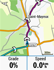
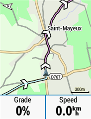
The Lords prayer - dear God, please make Garmin change the route color to green - my old eyes can't clearly distinguish the magenta route among the other road colors in the tiny gps screen. Hollowed be thy name. Amen.
I absolutely agree with this. Purple route is very hard to distinguish from red roads. I brought this up with Garmin before and they said it works fine with their maps, but not with custom maps like Openstreetmaps. I hope they will make it as an option to change the color of the course on the map.
It has been almost a year since this topic was started and I wonder if this request been addressed yet?
I really agree with the topic starter. Bright green is the only colour that is clearly visible on the map. Even with bright days and while wearing sunglasses.
Adding another colour shouldn't be that difficult is it?
The whole issue of the "magenta" line goes back even longer and was frowned upon and changes wanted back in the days of the Edge 800 probably over 10 years ago . One of the biggest issues I always found was night riding with the back light on and wearing yellow tinted glasses which are ideal on a night time and day time, the magenta line vanishes and just resembles a muddy colour which just looks like a road. Remove your glasses and plain as day the magenta line is as visible.
If you are not used to it, your immediate reaction is to think you are lost and off route so you start zooming out to see where the course is and you still cannot see it. My workaround was to carry tinted glasses for the daytime and clear for the night
But, if nothing has ever been done about the magenta line issues in all those years, why expect Garmin to do anything about it now.
Adding another colour shouldn't be that difficult is it?
It might be possible using the "Themes" from FW 8+
If you look at the MTB Theme the "magenta" is a paler color and if you dig into the XML definitions for the MTB Theme there are settings for some colors which might cause this.
I played a bit with these to try to get a bright pink (like the "Turn Guidance" overlay) as I don't use turn guidance but my experiments were not successful and I was going back to FW 7.10 anyway because of other (dropout) issues. Perhaps someone else can have a go?


Classic Theme MTB Theme
From the "Mountain.kmtf" file in the "MAPTHEMES" directory
</style>
<style field="MPM_RTE_MAGENTA_CLR">
<color>
<primary day="#ffc88cc8"
night="#ffc88cc8"/>
<secondary day="#ffc88cc8"
night="#ffc88cc8"/>
</color>
</style>
<style field="MPM_RTE_MAGENTA_CLR_1">
<color>
<primary day="#ffd09cd0"
night="#fff0bcf0"/>
<secondary day="#ffd09cd0"
night="#fff0bcf0"/>
</color>
</style>
The problem with changing the route colour to green would have the same issues as if it was changed to red, colour blind people would have difficulties making it out. I myself am not colour blind, but, a combination of red and green gives a 3D effect to me which is how your rods and cones in your eyes evidently interprets those two colours, one of the colours stands out and the other one seems to be behind it. The signs on fast food shops like Pizza places often have green and red signs, to me, they look strange.
But even that effect could be taken advantage off possibly, where the road stands out in front off the map.
Also the issue with a green route colour if your riding in a heavilly forested or wooded area and everything on the map is green almost, I don't think MTB riders would be impressed.
But when it comes to colours on a Garmin device, there is a lot to be desired. I for instance struggle with these profile colours, they are an abomination and serve no purpose whatsoever, there is not one colour that I can use for an activity profile in which I can read the white text on and same with the black text. The only time I can read the text regardless off colour is when it is dark and the backlight is on. And the same applies to Climpro, if I use any other colour than the dark blue, I cannot see the activity colour on that very thin bar that goes across the bottom to indicate how far up a hill you are. The dark blue just looks like a black stripe. But if I use Dark Blue, the white text is tpo hard to read on it when outdoors, indoors it is not so bad, then the paler colours make white text even harder to see.
When I select data fields or menus etc out on the road, I always have to scroll past what I am looking for with black text on a white background which I can read, and then scroll back one place. There should be an option to not use profile colours and just use white and black text on white or black backgrounds.
Usually when I do very long events, I break it down into stages, and for each stage select a colour for it in the order of a rainbow and select it to permanently display and then I can see on the map when a stage starts and ends. This is then covered up by the magenta line for the particular stage I am riding. But, the problem with selecting colours from the rainbow for the stages, most of them cannot be seen due to blending in with the roads etc.
A workaround I occasionally do is, just turn the map off and follow the breadcrumb trail, then any colour is visible. Yet to try it though on the 530
In reality, no one colour would please everybody for the route colour and it should be open for a user to select whatever colour they want. Not just have one colour enforced on them.