This discussion has been locked.
You can no longer post new replies to this discussion. If you have a question you can start a new discussion

Black & white mode for map / route clarity.

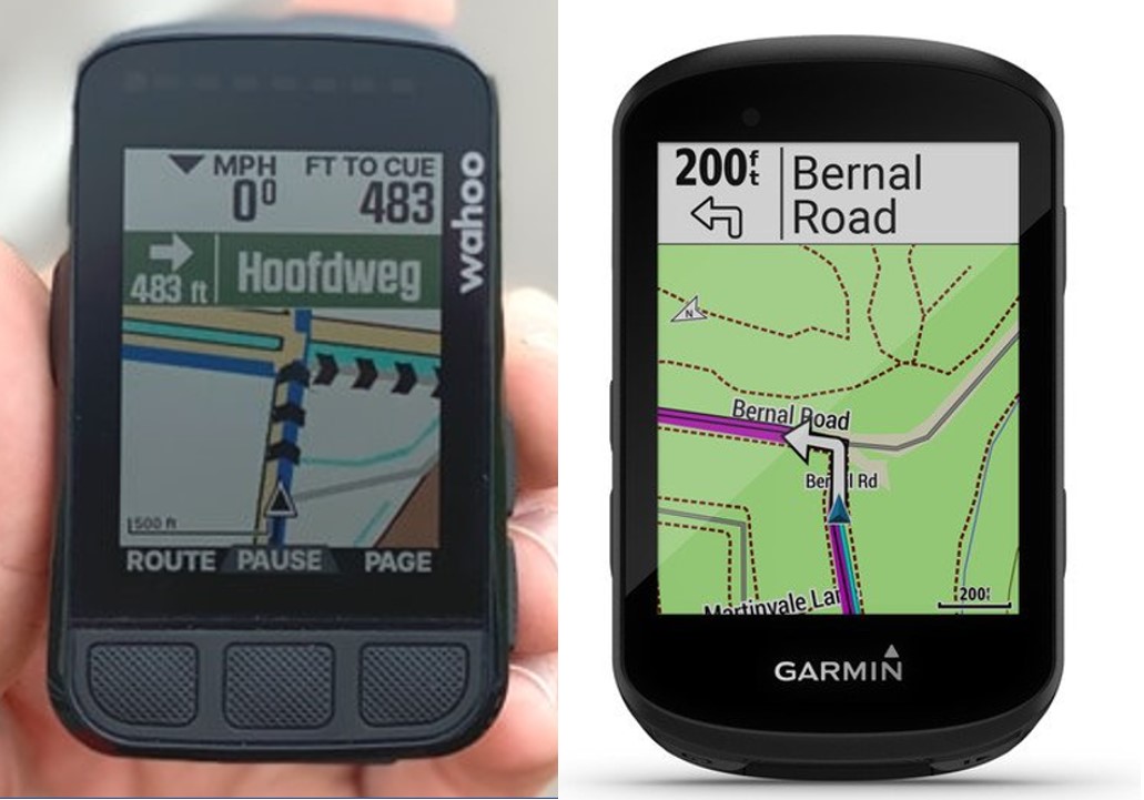
Maybe i should have bought the Wahoo instead. The 530's map is next to useless with sunglasses on. Especially the routing - magenta colored route. I can't differentiate it from the other roads. Perhaps if we have a black (road ) on white background map mode - it would be 100x easier to see....and a bright green colored route (or chevrons)....wait - i should have bought the Wahoo.

  • Oh, same thoughts exactly! The map navigation is useless with sunglasses on and frankly the whole UX is so user unfriendly.

  • Take a look at the beta build. It has added some new map themes that may make it easier for you to see the map.

  • There is always the option to source maps from other sources that have different colour schemes or create your own maps with your preferred colour scheme.  No other bike GPS maker allows you to do that.

  • that is true but it's not an easy task an everyday person would have the stomach for - it's a huge learning curve. remember that it's a wobbly jerky bouncy 2.6" screen you're looking at while cycling - not a 65 inch OLED tv in the living room. More colors doesn't make it better. Try with sunglasses on and you'll see quickly why all of us are bitchin for a smarter color scheme ie. less color more clarity. Get out of the Garmin parking lot cycling and reality will hit pretty quickly. 

    The new B&W color mode is a step in the right direction - the chevrons are great too. Baby steps.....baby steps......

  • I don't particularly like Garmin's default colour scheme either.  That being said I can see it OK wearing sunglasses.  If your sunglasses are polarised and if angle of polarisation happens to be closer to 90 degrees of that used in the screen of the Edge unit (all LCD screens have a polarisation layer) then it will make it harder to see the screen.  I don't use polarised glasses while cycling.

    Creating your own map definitely does have a learning curve and that would put many people off from doing that but you can source other maps that can be put straight on the Edge units and they have different colour schemes.

    I create my own maps and my own colour scheme has less than 10 colours and I think is a lot clearer than Garmin's colour scheme.  It just depend son how you use the colours.

  • Garmin's position arrow color scheme sucks - so hard to see exactly where i am in a glance - the blue doesn't stand out at all - i had to look 3 times just to ascertain my position on the map. Compare it to Wahoo where they have highlighted the arrow - it's quick and easy to see exactly where you are.

  • now that we've got the surrounding roads dulled down - please allow us to be able to choose the route color - magenta is still too dull in comparison to a bright green !