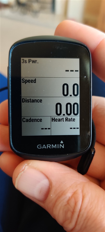
My data readings are to the right of every field, there is loads of room for these to be displayed centrally, nicely in the middle. This would be a really nice option especially with the 130, as the screen isn't massive, this is my only negative criticism with this unit, it does everything I need it to do otherwise, I'd just prefer my data in the middle of the field, it's easier on the eye and makes more sense. For instance speed way over in the top left corner and value opposite bottom, I have the Varia radar and if I'm not mistaken this also covers the values.

