Timer and Elapsed Timer Fields - Hour Digit Not Visible

My Edge 1050 is the first cycling computer I have ever owned. When using the Edge 1050 and out on a ride for over an hour, I cannot see the hour digit in the Timer or Elapsed Timer fields. Why is that? It seems like a very basic thing to me to be able to see the full amount of time of your ride. I typically ride for several hours and not knowing what hour of the ride I am in is VERY frustrating.

Can't the font size of the time be reduced just slightly to be able to show the full hour and minutes? Since I am new to the Garmin cycling computer, I figure I must be doing something wrong as this seems like a very basic thing that would frustrate just about everyone. What am I missing here?

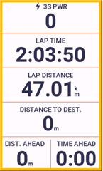
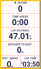
  • It shifts the hour to use a superscript in the those data fields are in a half screen width layout.

    If you would like the hour to remain full size then change the configuration of the screen so that those data fields are placed in a full screen width layout.

  • Very much appreciate the reply and advice. I did discover that using the full width data field "solves" the problem. But it seems like an easy software fix for Garmin to simply reduce the font size slightly in the shorter width data field when going over an hour. I would think MANY more people would rather more easily see the hour digit than the seconds. Or make it a toggle for people to choose. Thanks again aweatherall. Slight smile

  • To illustrate what I posted above. The time data when displayed in half screen width data field does still display the hour value. The value is display using a superscript. If the data field is a full screen width data field then the hour value is displayed using the same font size as the minutes and seconds.


  • Thanks again aweatherall for the screenshots. While the superscript looks very readable in your screenshot, at least for me it is not when the computer is mounted on my bike and I am in a seated position. I cannot quite tell what the digit is, it almost looks like just a dot. Again (Garmin are you listening?) a simple toggle switch in the settings somewhere to let the end user choose which they prefer seems like it would be the best solution for everyone?

  • As a follow up to your response on this issue, I did a quick test. I am disappointed to say that using the full width data field for the "Timer" does not display the hours digit in a full-size, normal font. First screenshot shows the "Timer" in full-width data field. As you can see, it still displays the hours digit in superscript. Second screenshot shows the "Timer" in a half-size data field, with superscript as you would expect. And third screenshot shows "Elapsed Time" and "Lap Time" in full-width data field and hours digit displayed as (I believe) it should be, in a full-size, non-superscript, font.

    ***Garmin, if you are monitoring this thread, can you please get this issue fixed? The "Timer" field should display the hours digit in a normal, full-size, non-superscript, font when in the full-width data field. It should be consistent with the way the hours digit is displayed in the "Elapsed Time" and "Lap Time". I believe it is a valid software 'bug'. Thank you***

    ***ALL: I apologize but no matter what I do for some reason my screenshot images keep converting to these large size images. I've tried editing them down to smaller sizes but when I save my reply the images re-size themselves back to the larger images. Disappointed***


  • As you can see, it still displays the hours digit in superscript. Second screenshot shows the "Timer" in a half-size data field, with superscript as you would expect. And third screenshot shows "Elapsed Time" and "Lap Time" in full-width data field and hours digit displayed as (I believe) it should be, in a full-size, non-superscript, font.

    ***Garmin, if you are monitoring this thread, can you please get this issue fixed? The "Timer" field should display the hours digit in a normal, full-size, non-superscript, font when in the full-width data field. It should be consistent with the way the hours digit is displayed in the "Elapsed Time" and "Lap Time". I believe it is a valid software 'bug'

    Looks like a good catch there

  • It is something about that specific layout.