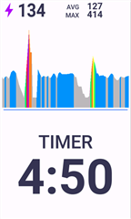
In the 1040, they made complete sense. If you were in a zone for a period of time, the entire graph across the x axis would show that color. A big chunk of purple, you can see it at a glance while using the device.
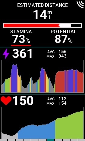
In the 1050, the graph is always mostly gray with some twinge of color near the top. It is far less informative! Even in a screenshot it is much much worse.
This needs a look, it is not good design.