
I have the power & heart rate graph on one screen and use it most of the time when riding.
Ideally the graphs look like this:
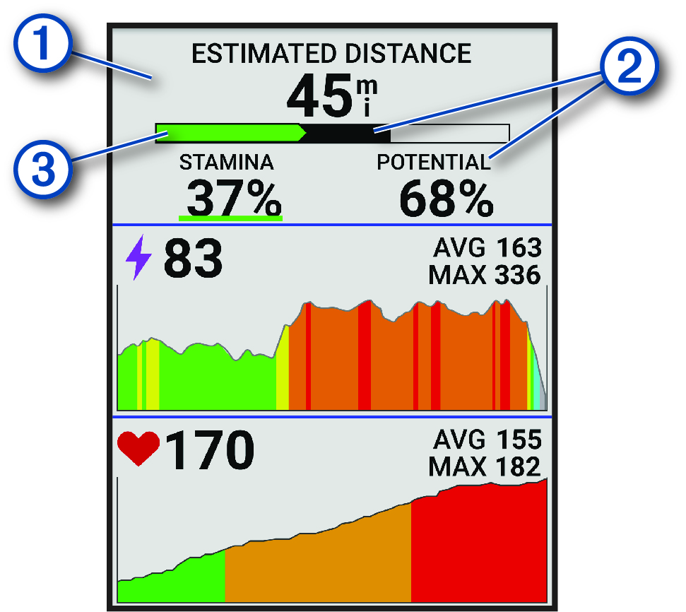
Nice colors, a clear indication of the zones and zoomed correctly.
But when your hear rate or power is quite steady for a while, the auto zoom function kicks in too much and the graph looks like this (see heart rate):

Where you have peaks for only one or two beats more or less.
The same peak in the first screen is an increase of 20 beats where on the last image it's only 2 beats.
That looks so unrealistically.
Would it not be possible to introduce a third option in the graphs (next to time/distance) to disable this "autozoom", or at least make it zoom less?
Or is this already available?
