
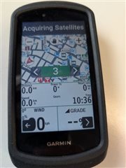
My default screen layout for the Map data screen has regularly been three data fields:
- A wide one at the bottom for the MapDashboard MS
- Two narrow fields above it which I tend to use for grade and Windfield
With 29.17B it looks like the default three data field layout is now wide field above the two narrow fields.
Is there a way to switch these back around so that the single field is on the bottom? Having the wider field at the bottom is somehow more aesthetically pleasing!

