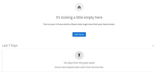
Welp, the home page just got totally useless for me. I started with Garmin in 2010 and GC has always been wack in one way or another. I gave up using it as a repository of my activity history and analysis…
I have a couple of URLs to access Connect (Web) which take me directly to the Courses List or Activities List bypassing all the new useless stuff, which I now never see
Yes, an absolute disaster! Whoever thought this was an improvement?
I am not interested in any of the “Glances” or “In Focus”! (You do not even seem to be able to customise the “In Focus”.)…
A few days ago in another thread here on the forum I wrote: for the beginning of winter they messed up the ski widget, for the beginning of the spring season they messed up the widget for controlling music from watches and Edge. I added at the end that I'm curious what they'll break this time for the summer. So there we have it - it's not even summer yet, and they've already busted Garmin Connect Web - I now have some crappy site with no way to add custom dashboards.
Yes, an absolute disaster! Whoever thought this was an improvement?
I am not interested in any of the “Glances” or “In Focus”! (You do not even seem to be able to customise the “In Focus”.)
This new design is for the stats, training & health freaks. Good luck to them but Garmin has screwed the rest of us!
I just want to see the what I had before, the presentation of which was prefect for me - Gear(s); Devices etc.
All I have now is “Todays Activity” and a pathetic message saying my dashboard looks empty! Even if you have some of the crap, you do not seem to be able to reorder the screen as with previous dashboard.
I moved to Hammerhead after sending my 1040 back as IMO it’s rubbish. However, I still also ride with my 1000 for Connect which was much better than the HH Dashboard. However HH now have a great opportunity to outdo Garmin on the web dashboard. So well done Garmin for giving the competitors a leg up.
In fact it's worse than I thought. It's not a Dashboard any more it's a Home Page, so you get the same on the web on PC & iPad and on the App on the phone.
I used the Web on PC & iPad for biking with my Edge 1000 and my phone app for my Fenix where I had the glances for Heart Rate, Steps / Floors etc.
Now you have the same on all devices. The original Glances on the phone app were aligned horizontally with a quick view, now you have huge boxes that will require a lot of scrolling if you have a lot of Glances.
This is how my web page looks this morning:

Bravo brilliant! What a joke!
There is also a major bug as I have no "Last 7 days".... I went biking yesterday and 3 others times in the last 7 days using the Edge 1000, so where are they? They do show in "Activities" but not on the brilliantly informative new Home Page.
Fortunately they have, as yet, not cocked up the other Connect areas which appear not to have been affected. The Calender & Reports are two of features that make Connect better than the HH Dashboard.
Bottom Line: Garmin has to re-instate the Dashboard. If someone really thinks the new design is the bees-knees then have it as an option.