
This relates to multiple EDGE devices. I'll comment here as the 1040 is the flagship EDGE at this point.
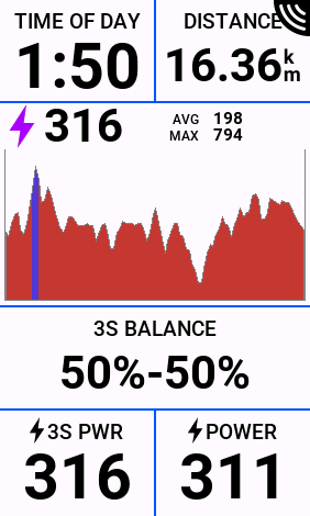
I find using the Power Graph graphical data field extremely useful for power pacing on the bike. The 100 second rolling graph is a great visualisation for keeping in the 'zone' without having to read a number and watch it bounce around.
One enhancement I'd like to see is a better Y-axis scale, or maybe some Y-axis scale options (similar to how we can chose that on elevation graphs). It appears the current Y-axis scale is based on the 100s rolling high/low power numbers, which means the graph becomes jagged and less useful if holding say 200-215W for the 100s.
Case in point below. Two screenshots of the same effort taken within a short period of time of each other. The graph on the right containing a 0W and therefore showing the Y-axis on a different scale. This right side graph is much easier to pace with:
 .
. 
Maybe an option in the top right corner of the graphical data field to scale to 0W, scale based on the rider FTP, or some other way I haven't thought of?

