
On my new 1040, when navigating a course, set so I get directions via map pop up instead of by text, the pop up is devoid of any map context -- just showing a route line with my blue arrow location on it. On my 1030 (not the Plus), all of this was overlaid on the section of the map where I was turning, providing much better context for making sure I made the turn. Comparative screenshots (1030, then 1040) attached below:
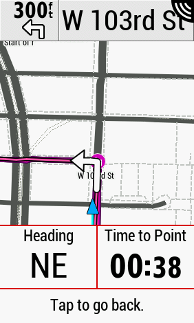
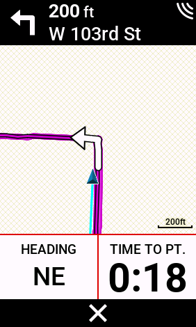
Maybe this is by design, but I hope not, as it definitely is a regression and less useful. Plus, I can't say I'm a fan of the dark color at the top and its failure to match the theme at the bottom.
Can anyone advise? I haven't upgraded to 17.26 yet, which cryptically refers to "fixed segment turn guidance", but I doubt that's referring to this issue.
Between this and the continuing gradient lag issue (my 1030 wasn't perfect, but was well within the range of acceptable), I may have to try to sell/return the 1040, even though its hardware (and battery life) is great.
