This discussion has been locked.
You can no longer post new replies to this discussion. If you have a question you can start a new discussion

Display Quality

Hello fellow Garmin users,

I recently purchased a Garmin Edge 1030 Plus, excited to take advantage of its touted navigation features. However, I've been facing a significant issue that's making the device almost unusable for me: the poor display quality.

What's the Issue? The display on my Garmin Edge 1030 Plus lacks contrast, making it incredibly difficult to distinguish between the route and other streets. This is particularly frustrating because the box and the website showcase vibrant colors that simply aren't present on my device. I've tried navigating through the settings to adjust the map color, but to no avail. The device doesn't even offer the option to change map colors, contrary to what I've seen in promotional materials.

Why Is This a Problem? The lack of contrast and color differentiation makes navigation a nightmare. I bought this device primarily for its navigation capabilities, and it's failing to deliver on that front. Garmin's customer support insists that my device is functioning perfectly, but if that's the case, then the product is fundamentally flawed.

Is Anyone Else Experiencing This? I'm curious to know if other users are facing the same issue. Is it a widespread problem, or is my device an outlier? If you've found a workaround or have any tips on improving the display contrast, I'd love to hear them.

In summary, the Garmin Edge 1030 Plus is falling short of expectations due to its poor display quality. If you're considering buying this device for its navigation features, you might want to think twice.

Looking forward to hearing your thoughts and experiences.

Gr,Bruru

Top Replies

All Replies

  • Have you ever tried to go outside? :D It is a transreflective display so it has nice colors when it is on direct sunlight.

  • The pictures are taken outside so that's not the solution

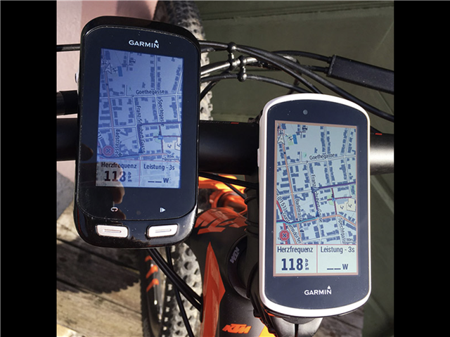
  • This is a comparision of Edge 1000 und 1030 (same Display as plus) taken outdoor (years ago…)
    I can confirm: bad contrast and colors inside - super contrast and colors outside!

  • The pictures are taken outside so that's not the solution

    This doesn't appear to be true. It's not likely you moved your monitor and computer outside to take the pictures.

    The lack of contrast and color differentiation makes navigation a nightmare.

    Tens of thousands (at least) of people manage to use these for navigation. The screens aren't perfect but they aren't a "nightmare" (for these people) either.

    This is particularly frustrating because the box and the website showcase vibrant colors that simply aren't present on my device.

    This is a bit misleading but it would also be misleading to take a photo of the screen as well. As it happens, either choice is a problem. The only fair/accurate thing to do is to have customers see the actual device in an appropriate setting (not indoors).

    Note that you can enable the device to allow screen shots. When you view these screens shots on a computer monitor, they look "vibrant" (like the images on the box). Clearly, Garmin is using screen shots rather than taking photos of the screen.

    The Garmin screens don't rate high in "color accuracy" but there's a (good) reason for that.

    Screens that are reasonably "color accurate" use too much power.

    A big part of the design requirements for the Edges is to have long battery life. This requires giving up other features (like "color accurate" screens).

    The screens Garmin uses in the Edges are "transreflective", which allows them to be visible without a back light. These screens work much better in direct sunlight. Backlit screens typically are barely readable in direct sunlight because the backlight isn't strong enough. These screens require the backlight to be visible at all.

    Transreflective screens are a compromise.

    One gains better bright sunlight visibility and better battery life but give-up color accuracy.

    These types of screens aren't what people are used to and they take a bit of adjusting to get used to them.

    =================

    To make the screen more visible in sunlight, the device should be mounted close to horizontal. This allows the sun to hit the screen for fully in more situations. People’s instinct is to mount them so the are more perpendicular to one’s eyesight . This doesn’t work as well.

  • Hello, and thx for you response. 

    Like a mention in my post the picture are taken outside. I feel a lot of people are trying to defend a product like they are part of the company. 
    It's just a bike computer, and from my experience a very *** one. Its not because then thousand people jump of cliff that it's also a good idea to do the same thing. 
    Garmin seems to me like an old company in a new world. People expect the same quality like the strava app on the screen of a modern phone.

  • Its not because then thousand people jump of cliff that it's also a good idea to do the same thing.

    This is a “all the customers are stupid” argument.

    Probability-wise, it’s not very likely.

    I understand what you are talking about but it’s not a problem to the degree you think it is (unless everybody else is stupid).

    Again, if it’s a “basic feature”, there would be many alternatives to choose from. 

    It’s fine if you don’t like it. You can’t please everybody. 

    Garmin seems to me like an old company in a new world.

    The Edges are certainly an ongoing evolution of a old line of products.  They still work for many “stupid” people. In any case, a complete re-engineering of these products would likely be too expensive and too risky for Garmin and the (not guaranteed) payout too far in the future.

    People expect the same quality like the strava app on the screen of a modern phone

    They can do that. These people shouldn’t be using Garmins.

  • I just got the 1030 plus brand new. Display quality is dull and hard to distinguish at night. Colors are poor close to the gray tone exactly like in the pictures. There are several posts with this same issue. My 530 is excellent, the 1030 plus a disappointment.

  • Yea, after a couple of months using it it's now back in the box. I'm afraid to sell it because it such a bad device I'm ashamed asking money for it. 

    What really baffles me is the people defending this "product" with some good old victim blaming.

  • I think it is probably a question of your use case.  I almost never look at the map screen.  Most of my screens are showing my stats like speed, cadence, hr, ETAP etc.  I rely on the turn by turn for navigation as I’m almost always using loaded routes.  When I need a map I use my iPhone.

    Not defending the product, just saying. 

  • Screen technology is about tradeoffs. Garmin picks screen technology that trades contrast and "vibrancy" for better runtime while retaining a nuanced spectrum of colors. Wahoo picks screen technology that trades number of colors (e.g. you would not do terrain shading on a wahoo map screen) for better runtime and contrast. Hammerhead picks screen technology with stronger colors at the cost of terrible runtime. (others in the market seem to just run with whatever garmin did ten years ago).

    The USP of Garmin is their excellent runtime, it would be silly to compromise that with a slightly prettier screen (I believe that a "Garmin with a Wahoo screen" would be a good device, but garmin has had full color screens for more than a decade, so if they suddenly started downgrading color resolution to get more contrast many buyers would be disappointed)