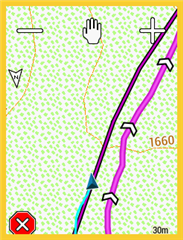
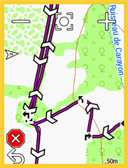
After the last update that was, again the big arrow disappeared.
There have been all sorts of suggestions here in the past, but unfortunately they do not work now.
Anyone have any idea?
Thanks
tani gazit
It's so frustrating that Garmin won't allow us a separate setting to enlarge the position arrow and change its color.
And the route path to be followed is not distinct in size, color nor texture. It is so hard to discern, especially at a glance. I tried to use a route for mountain biking over the weekend, and my screen was nothing but a bunch of different lines with no way to tell which line was what. Ugh.
Having North certainly would be more troublesome. I also wonder if the elimination of the large arrow had something to do with the new direction arrows. Perhaps Garmin thought the larger arrow would not work out with the direction arrows. I haven't decided on whether I like the direction arrows. They seem too big and there are too many of them which causes the screen to appear more cluttered. It would be nice to have a option to turn them on and off.
haven't decided on whether I like the direction arrows. They seem too big and there are too many of them which causes the screen to appear more cluttered. It would be nice to have a option to turn them on and off.
Oh, yes, yes, yes, I greatly dislike the "direction arrows" and especially as the arrows are even larger if "turn guidance" is disabled, for some inexplicable reason they grow by about 40% ? My riding is often long distance with much night riding and it is very important to have a map with minimum clutter so I have in fact gone back to previous release to get rid of the arrows, please Garmin provide a disable switch for these direction arrows


(with "turn guidance") ("turn guidance" disabled)
You can change the look of the cursor. Maybe helpful…