Sun 24h runaround widget isn't really logical

I really like the 24h sun widget on my Instinct Solar display. However, it isn't really totally logical for the night part.

In the current implementation, at 24 / 0 hours / midnight, the sun is always at '6 o'clock', thus at the bottom. Basically, what it should do, in my humble opinion, is to simply split the day into two separate moving speeds for the sun, i.e. dawn till dusk, and dusk till dawn. Instead, here, it basically separates day and night into three parts, one for day and two for night.

I can't really understand the logic behind this.

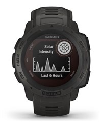
  • Any chance you are referring to this Solar Intensity icon that is also on some watch faces?

  • Hi Chris, thanks for your reply.

    No, sorry for wording it unclearly. In the little round window where one can display the solar intensity icon, one can also choose an icon with a dotted circle, where the top half is light, and the bottom half is dark, to symbolise day and night, and a small circle runs around symbolising the sun above and below the horizon.

    Edit: I just saw that some months ago someone suggested changing the layout of that icon like a pie chart:

    https://forums.garmin.com/outdoor-recreation/outdoor-recreation/f/instinct/252032/sunrise-sunset-graphic-suggestion

    I personally don't think that's a good idea, aesthetically speaking.

    But the bottom point of that circle always being midnight doesn't really make sense.

    If anything at all, but that would make it more complicated, one could split the runaround into four parts, including from the moment the sun touches the horizon until it leaves it, so as to accurately display dusk and dawn. Because at the moment, the sun touches the imaginary horizon way before the real sunset, as only the center of the symbolic sun is honoured, and the symbol of course is not to scale.

    Edit: Others, again, in that thread I linked to, had suggested raising and lowering the horizon in accordance with the seasons, which is also an interesting idea.

  • The dark part represents the entire night, not only midnight.

    Anyway, I also like the idea of adding gray sectors to represent dusk/dawn (if it is possible). Lowering/rising the horizon or using wider/narrower angle to represent the change of day length also sounds good. I suppose both are technically easy to do, but I am not sure how well so much detail will look like on such a small circle. Garmin may have decided to keep it simple, but better readable.

    As an example, in my location, current twilight times are approximately 30 minutes both in the morning and in the evening. In the case when hours are evenly spread around the circle, 30 minutes result in a 7.5 degree angle, which (I suppose) will look like a thick line. Alternatively, they could be bigger and the sun could move at different speed in each sector, but then the sun speed would be so different that it would be confusing. Also, you will no longer be able to tell how far has the sun traveled since sunset or sunrise, because of the sectors being too disproportional.

    I guess, redesigning this icon requires serious thinking...

  • I think you misunderstood what I meant about midnight.

    At the moment, the sun on the widget is *always* at the bottom of the circle at midnight, which makes little sense, as sunset and sunrise are not at same time distance from midnight. Midnight is a virtual measure, not a natural.

  • Ah, I see. As a matter of fact, until now, I never realized the six o'clock position is midnight. I've always thought the icon shows the actual position of the sun below or above the horizon, not the time of the day. I don't look at that widget so often, so I haven't noticed.

    And as for this, I completely agree with you. The sun icon should not be at "six o'clock" at midnight nor at "twelve o'clock" at noon, because these points are not usually the middle of the night or day.

  • Funnily enough, during daytime the widget behaves correctly. Only during the night, at zero hours, the sun always equates the six o'clock position - which makes no sense.

    I guess the programmer was not easily able to access the sunrise time of the next day, so instead of taking it from the current day, which will only be slightly off, he resorted to always having the midnight sun at the same position. (I am un-PC-wise assuming he.)

  • Anything on this suggestion at all? Does it even make sense to send this to some suggestions email, as similar ideas have not at all been reacted to?

    I realise this is no show stopper, as most bugs aren't, but I must repeat: The sun movement during nighttime is not logical - the position on the widget is always exactly at the 'six o clock' position at midnight. This implementation makes no sense.

  • Yes, it makes sense to send the suggestion. If you don't, it will never be fixed, but if you do, you will at least make them aware. A minimal chance is better than nothing. And I am saying it is minimal, because they will probably also consider it unimportant.

  • Thanks for your input. It unfortunately is my dominating feeling with Garmin that absolutely everything not directly influencing the short term financial bottom line is considered as unimportant.

    There is always a new model to be prepared, some bigger bug to be squashed, but this kind of thinking leads to shoddy software at many points, in my opinion.

    Also, considering the very low turnaround of ideas in this forum, there is absolutely no conceivable reason why developers don't have a short glance into the ideas here every few days and react to them, if not in the forum, then simply by changing things in the software.

    The whole logic of having to send the exact text that was posted in the forum to an email address seems like from another century. I have the feeling that anyone daring to actually criticise Garmin's products here is seen negatively, instead there being genuine thankfulness for the free beta testing.

    Just look at all the posts regarding the Instinct Solar Surf. Nothing changed. It just fizzles away.

  • There is a lot of bureaucracy in large companies. Even if some of the developers read the forum, they can not just pick up ideas from here and start working on them. All work is usually approved, organized and prioritized by a dozen of managers.  And, of course, money matters most of all.

    I am sharing personal experience. I am also a software developer (not in Garmin), so I know what is it like inside such an organization. Sometimes, even we wonder why we are given seemingly unimportant work, when there are annoying or incomplete things such as the sun icon position or the surfing issues you mentioned.