The heart rate font on the single paramtter board is too small.

Can you make that when I display my heart rate while running it will be maxed out?
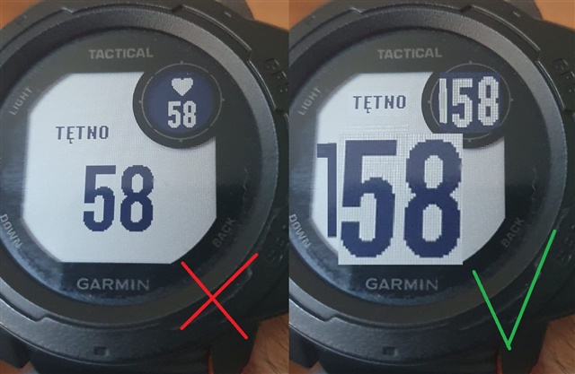
Few people run with reading glasses and many people have a visual impairment. It's supposed to be a lot like an elephant. Readability should be extreme, after all, when we run we are in motion? The display on the Instict 2 Solar is quite small - but nothing prevents those digits from being two/three times larger.
Thank you on behalf of all those with poor eyesight.

This is what you should do in every watch, and I can't fathom why the company has been developing equipment for so many years and hasn't figured out that a larger font is more readable.

Top Replies

All Replies

  • Maps are different because the entire screen (all pixels) needs to be redrawn for a small pan/zoom. Also, the Fenix has a color MIP which requires more power than monochrome MIP on the Instinct, so it is not a fair comparison.

    Data fields on the other hand are not like that. Even if the (big font) hear rate were the only data field being displayed, it would not consume the entire screen real estate, as can be seen from OP's mock-up image. Also, OP is talking about a data field in an activity page, and there are many such fields that have high refresh intervals (speed, cadence, distance etc.).

  • Probably best to buy a watch with bigger screen size

  • Probably best to buy a watch with bigger screen. Your watch hasn't changed and you must have done research and been happy with it when you bought it