This discussion has been locked.
You can no longer post new replies to this discussion. If you have a question you can start a new discussion

Instinct 2 Solar (Tactical) "Washed Out" Display: Anyone else having this problem w/their display?

   T

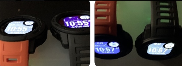
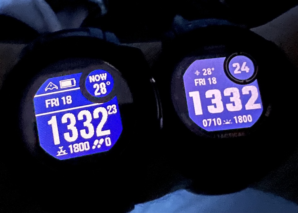
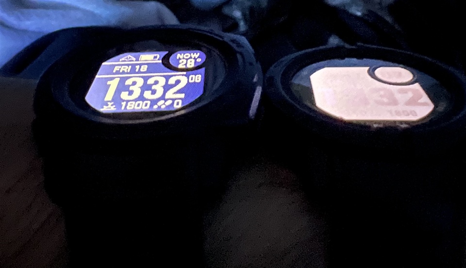
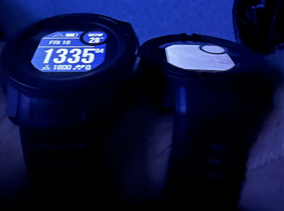
The GI2 (on right) is much more "washed out" and closer to purple when compared to the original's vibrant blue (on left); both are backlit to 100%. Moreover, the viewing angle on the GI2 is simply terrible... clearly, the new "domed" PowerGlass does not add one of the primary advantages of having a domed crystal which is improving the visibility at acute angles (especially underwater) by mitigating light reflectiveness. I'm not impressed at all. As opposed to the original solar models, the new GI2s have a "full" solar panel behind the display, so this may be the cause of both the tint and viewing discrepancies; I've contacted Garmin support and am waiting for some explanation... hopefully it is just that I may have a defective watch (which can then be replaced by Garmin).  Also, much as I appreciate the improved display resolution of 176x176 (which does make the text look crisper), they've taken advantage of that to make the overall text smaller in order to fit more data displayed on the screen size; that's all well and good, but it does make it more of a strain for legibility... not all of us have a 25 y/o sight. As usual, Garmin did incorporate a font size setting; I've provided them with that feedback and feature suggestion, so hopefully they will add that in a future update.  Has anyone else noticed this issue? 

  • Could you take another shot where the Instinct 2 is more horizontal and the Instinct 1 remains at like 30 degrees?

  • Please find photos of my Instinct Solar. I didn't put any graphic correction. As you can see Instinct 1 has excellent contrast from really low level but it becomes "milky" when I took photos from opposite side. I'm afraid this is exaclty what we were talking about: polarizer (or other element) is rotated 180 deg compared to Instinct 1. Is a shame because I don't need this "above" visibility. To be honest I didn't even realize that there is this effect in my IS1 because this angle is never in use.

  • Garmin has already commented on this. Different display, different viewing angles and the possibility of wearing a watch inside the wrist. I must say that I am not interested in these angles. I can't even look at my watch from these angles, I have no problem looking natural. Why look at such a big angle. Are you doing this on your phone or computer? At 99%, the display is perfectly legible. In addition, in full sun, where most use it more than the backlight at night. Yes, that's my opinion, but I can't praise the watch. Solve extreme angle, why?

  • Is this explanation for you acceptable? This way next iPhone can get the same display with the same issue and Apple can say "we used different display". Also wearing inside the wrist...this sounds... hard to comment that.

    Ok, TeaRacer, I'm not here to convince you that you should be unhappy with the watch or return it. I'm glad this doesn't bother you because other than that Instinct 2 is complete, comfortable, lightweight watch.

    But for me this is design issue and for now I'm not convinced to buy it.

    Anyway thank you for videos and photos. It looks this is the same display I had.

  • I posted these here weeks ago and I’ll post again.  The instinct 2 is orange band and instinct 1 is black.  They are aligned side by side on a tube, as level and angled as close as the naked eye can achieve.  There is definitely a huge difference when viewed at the normal angle you’d expect to view a watch at   The other pix is viewed from above where Garmin says you’d see when worn on the underside of the wrist   Clearly instinct 2 is much clearer and now instinct 1 is cloudy and hard to read    No question in my kind the display glass is flipped   I can’t imagine this is by design   

  • Well, you see, it looks completely different than in the original photos. Where IS 2 was filmed so that it was not legible at all. Now it is legible to see that each display is different. According to the videos and photos I gave, it is quite obvious that it is easily usable in 99%. If it does not satisfy someone, those border angles, he has a choice to buy another watch. I wouldn't want IS Solar back. :-)

  • You are beginning to speculate. There is a really different display on IS 2, it's visible to the naked eye. Anyway, the watch is legible, as I wrote, I would not change. I still look at my watch the same way, and if it weren't for this topic, I wouldn't even know that anyone has a problem reading it.

  • I'd like to confirm that mine is the same as Tearacer's. From a vertical angle it's not very legible, but from a horizontal angle it is. Really not a big deal for me personally, but I can see how in a very minority of uses (like riding a bike) it could be bothersome. 

    I'd like to echo that if that doesn't suit your needs, then return the dang watch lol

  • The pictures illustrate it perfectly: The difference between the displays on the GI1 and GI2 is totally obvious. To test it, all you have to do is wear the watch the wrong way around on your wrist. I get it that it doesn't annoy some people, but that is a total non-argument. There is a difference, and it's big, and for the vast majority of people, who do not wear their watch on the inside of their wrist and do not turn their wrist the whole way, but want to see time at a quick glance, this is a step back. It is especially annoying as in many cases Garmin uses smaller fonts on the GI2 compared to the GI1.

  • You know that according to those who posted Garmin's replies, Garmin itself was 100% transparent that the display panels are different, right?  Like it's beyond obvious they're different and Garmin even said they'd look different when compared to the gen 1.  So that's not a gotcha moment.