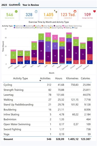
This one still works really nice:
You have to change your dates to 2021 so it gets sorted in the correct months (or you know your way in PowerBI and can adjust it there), otherwise a nice summary.
This one still works really nice:
You have to change your dates to 2021 so it gets sorted in the correct months (or you know your way in PowerBI and can adjust it there), otherwise a nice summary.