Resting heart rate lower than lowest heart

During times of sickness the heart rate increases. I am now experiencing a cold with fever and during nighttime my heart rate has been around 60-70. The night to yesterday the lowest single heart rate was 55 beats per minute. Despite this the watch indicates the resting heart rate (to my knowledge defined as the minimal average heart rate during a continuous 30 minute period) is 46 BPM. My best guess is the actual RHR is somewhere around 60. 

Is there some kind of algorithm which does not allow the RHR to increase more than a specific amount from day to day or is there something else wrong? Has someone else experienced the same thing? To me, this only happens when I am feeling sick and have an increased heart rate. When the heart rate is normal the RHR can easily be traced to a specific 30 minute period of the heart rate graph. 

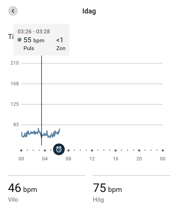
As seen above, a horizontal line at 46 BPM would be nowhere near the heart rate graph where the lowest heart rate is at 55 BPM. 

  • Answers to other questions and also articles on the official site seem to indicate it is indeed a two minute average. For example the official reason why highest heart rate is sometimes lower than peak heart rate during an activity:

    "The high heart rate, in either the Connect app or Garmin Connect web, shows the highest heart rate for the day based on two minute averages collected by the optical heart rate sensor on your watch."

    The highest value in the graph above, 75 BPM, is indeed the highest point in the graph between 02:54 and 02:56. 

    There are also no reason for a sample to have a time interval, 00:00-00:02, 00:02-00:04 and so on. The graph would also not be this balanced but have values all over the y axis. Because of this I am all but convinced it really is a two minute average on display. 

    Even if it was just a sample every two minutes, an average resting heart rate of 46 is impossible given no sample was under 55 BPM. The samples in the range of 55-65 would need an equal amount of (missed) samples in the 25-35 range. Not only is it extremely unhealthy but it is also highly unlikely (if not impossible) none of these low values were sampled and only the high ones. It is as unlikely as only seeing the result 5 and 6 on 15 dice throws in a row (approximately 1 in 14 million) given a fair die with a 3,5 average result. You don't see this every time you get a cold. 

  • Even if it was just a sample every two minutes, an average resting heart rate of 46 is impossible given no sample was under 55 BPM.

    As I have already mentioned above. The watch samples every second, while in Connect only one value is mapped for every 2 minutes. Thus it is not possible in Connect to see all the values that are between the 2 minutes. Nevertheless, the values in between (1 second sample of the watch) still flow into the evaluation.

    Therefore, it is very possible that the real value differs from the value given in Connect. 

  • I think I have given you enough evidence to suggest the mapped value for every two minute period is indeed the average of these two minutes and not a single value during this time. If the average of consecutive two minute periods is never lower than 55 BPM a 30 minute average will always be 55 BPM or higher, never 46. 

    If you are correct in that the value displayed, for some very odd reason, is not an average but a random sample from the two minute period, I think I also have proved beyond any reasonable doubt the extreme unlikeliness that no displayed value is below 55 despite the average being 46. Not only would this be a mathematical equivalent of winning the jackpot of a national lottery but would also require the not displayed values to be dangerously low (in the range 25-35). 

    I do not think we are moving any closer to a solution of this issue continuing this exchange. Getting a resting heart rate of 46 from the displayed graph is mathematically impossible even considering all your objections. 

  • I can't begin to understand why you would think this thread would be of any help. It is about a person not understanding the difference between the lowest recorded heart rate and the resting heart rate. 

    The fact that the RHR is 2-3 beats per minute ABOVE the lowest value is also not in any way surprising. The lowest value is ALWAYS lower than the average during any time period. The only exception to this rule is when the lowest value in a series is 55 and the average is 46 but I will continue to claim this is mathematically impossible.

    The thread however confirms my suspicions about the 2 minute values being an average, which you denied. It also confirms the RHR being based on a 30 minute period. This thread only strengthens my case. 

  • The thread however confirms my suspicions about the 2 minute values being an average

    Okay, then we'll stick with the average value. So you are saying that the average of a measurement taken every second (over a period of 30 minutes) cannot be lower than the average of a measurement taken only every 2 minutes ?

  • I am saying the 30 minute average of a measurement can not be lower than the lowest average of any included 2 minute period during the same timeframe. The 30 minute average will approximately be the the average of the 15 included 2 minute periods (or exactly this number if the start of the 30 minute period coincides with the start of a 2 minute period). 

  • If you take a measurement every second over a 30 minute period, you will have 1800 measurements. If you take a measurement every 2 minutes over a period of 30 minutes, you will have 15 measurements. In the graph Connect maps these 15 measurements, while the RHR is a value of 1800 measurements.

    Keep in mind that you are sick (get well soon). The fluctuation of your HR is obviously higher than normal at the moment.

  • You just agreed with me the 2 minute values displayed in the graph is the 2 minute averages. This means they are the average result from 120 individual values measuered each second. The average of 15 consecutive 2 minute averages (15x120) is EXACTLY the same as the average of the individual 1800 results.

  • You just agreed with me the 2 minute values displayed in the graph is the 2 minute averages.

    No, the graph does not capture a measurement for each second and ties it to an average. The graph is a single random data point at a measurement every two minutes.

    set a single data point every 2minutes, and connect the lines together. This is the graph. The measurement in between is considered for calculating the RHR, but not for the graph. 
    Thus, the graph captures 120 fewer data points in a 2 minute period than the measurement for the RHR.

    I wish you a speedy recovery from your illness. Wave