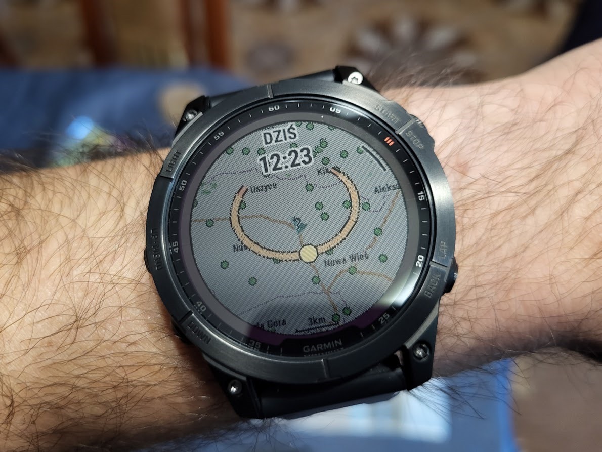
either it's just me or after the last update the sun position map got a lot darker and has these weird diagonal stripes. does anyone have similar?
either it's just me or after the last update the sun position map got a lot darker and has these weird diagonal stripes. does anyone have similar?
Updated June 8th, 2023:
Our engineering team has received your feedback. We are looking into improving the appearance so your map can be better read when using the feature.
Thank you to our passionate…
Apologies, but this "intentional design" destroyed the clear view of the details on the map. Like others already commented, I believe the outcome is not what users are happy with. If the gray background…
Have to agree with others. That change does nothing for the clarity of the information.
Going to reach out to Garmin-Christopher to check if this is working as designed after the update ?
The appearance is intentional design and it's showing correctly. The gray background is so you can see the yellow sun position without other items on the map interfering.
Have to agree with others. That change does nothing for the clarity of the information.
Apologies, but this "intentional design" destroyed the clear view of the details on the map. Like others already commented, I believe the outcome is not what users are happy with. If the gray background would simply disappear that would be fine. I think what we had before the recent update was just user friendly.

but it is completely illegible. In fact, you can see the yellow position of the sun well, but you can't see the background at all because those gray stripes, I don't know how to say it properly in English, confuse your eyes. you can see where the sun is but you can't see where it is on the map
I understand the point, but the implementation is really not very good. I prefer the old design. I don't want to say that it's completely unusable now, but it's very close.
The sun position map widget, as it appears in the 13.22 update, is detriment to its usability. The information was quite clear in its previous incarnation - the “other items on the map” did not interfere with the visibility of the sun’s position.
The previous version’s underlying details provided complementary information to “the yellow sun position.” It was not a hindrance. It was not necessary to do a redesign. I hope Garmin reverts back to the original widget in the next update.
Depends on the last map used, if you used a map like Talkytoaster last, then this widget will display the more detailed map.. then it becomes impossible to view unfortunately.
As Garmin maps lacks many details, it's legible as it is now with the Garmin map, but it's definitely a downgrade in readability.
It reduces contrast making everything less legible on my 7x SS
I need help understanding why the normal map page is not being used after viewing the sun position as needed?
The feature change is specific to the sun's position only so I am a little confused on why there is so much feedback and frustration. How often is everyone checking the sun's position using their watch. I appreciate better understanding from everyone.