Cadence graph sometimes looks like scatterplot?

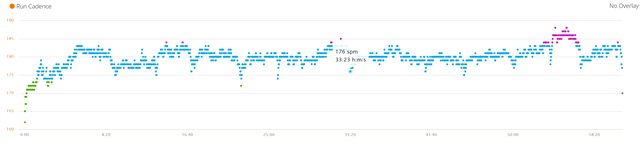
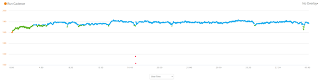
Hi everyone, just a curiosity question.  Sometimes my cadence graph looks like a scatterplot while other times it looks like a smooth line.  I assume the scatterplot graph is because my cadence is varying a lot?  I've reviewed the data and I cant find a pattern.  For example, I was initially thinking that perhaps when I run slower my cadence is not as consistent but I found graphs that look smooth.  Any way, here is what I am talking about.  I ran at a slower pace in the second image.

  • Look at the scale on the left. In the first image, it's between 160 and 190. On the second it's between 100 and 200. So your vertical resolution is 30 vs. 100. That's why it looks different. But it's still a bunch of dots as you can see after the 16:40 min mark in the second image, where you probably stopped for a short moment. If you'd simply move the points closer together in the first graph, the dots would also resemble a line.