
I always use Garmin during strength workouts. Started with VA3 and upgraded to Fenix 7S, but I feel that doing so downgraded my training experience during a session and I’m curious if others feel the same way.
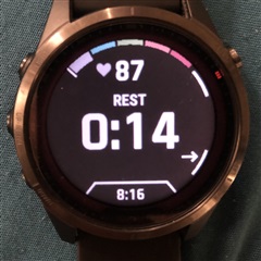
The VA3 has a Set Screen where you see the current step, the timer (went down on rest) and the heart rate and a Reps Screen.
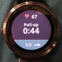
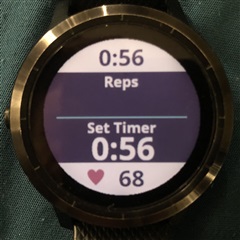
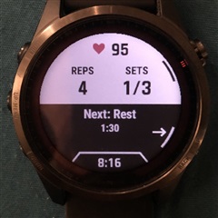
On F7 the Set Screen got combined with the Rep Screen which I think is excellent and also brilliantly adds the TOD, but fails by focusing on the next step instead of the current exercise. During pushups, does one think about rest or about putting in the work?
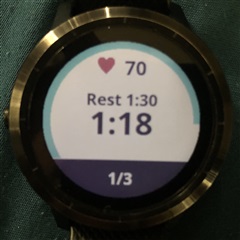
The rest countdown got separared into its own Screen. No HR display or Round count, which I don’t mind, and the addition of the next step is helpful here. But it fails in being a screen that appears only during rest and which you have to scroll to see it—which is my other issue. The Set Screen still displays rest, but it’s not a countdown timer like in VA3.
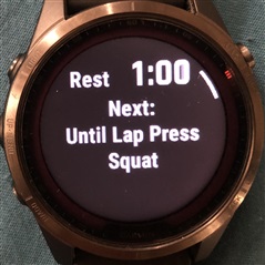
While the VA3 always has the Set Screen on display—which I always wished it could stay with a black background instead of changing to white during rest—the F7 switches after each step to a list of the whole workout, highlighting the current step. Now you must scroll up/down to get to the Set or Rest screen. Previous to this I only saw that list before starting the workout (if I wanted to) and on Garmin’s Connect App.
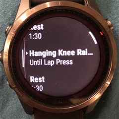
In my opinion I don’t see why it’s functional or valuable during a session, especially having to spend energy on scrolling through it every time to see another screen (there’s no skipping ahead and it's worst if Touch is deactivated).

I would suggest an improvement to this taking inspiration from the VA3, and considering the normal flow of a workout taking into account what one would prefer to see and do at each step of it.
Support the development of an inline skating app here.

